Une bonne page d'accueil attire l'attention et guide vos visiteurs vers vos produits et services. Vous avez de la chance, car je vais vous expliquer comment créer une page d'accueil qui convertit réellement.
Vous ne devriez pas commettre l'erreur courante de trop compliquer les choses. Certaines marques surchargent leurs pages de texte, dispersent des boutons partout et espèrent que la magie du design fera le reste.
Mais ce n'est pas la bonne approche. En fin de compte, une page d'accueil à fort taux de conversion repose sur l'intention, la structure et quelques bonnes pratiques intemporelles.
Et voici le rebondissement : vous n'avez pas besoin d'une refonte complète ni d'un outil de création de pages d'accueil pour y parvenir. Avec la bonne stratégie et quelques sections générées par l'IA que vous pouvez intégrer à n'importe quel site existant, vous pouvez transformer ce que vous avez déjà en quelque chose de puissant.
Alors, voyons comment créer une page d'accueil à fort taux de conversion spécialement pour vous !

Qu'est-ce qu'une page de destination ? (Et pourquoi est-ce important ?)
Une page de destination est une page Web autonome et ciblée conçu dans un seul but : inciter les visiteurs à effectuer une action spécifique. Ainsi, une page d'atterrissage ne cherche pas à satisfaire tout le monde, car elle délivre un message unique sans aucune distraction.
Par rapport à une page d'accueil, qui répartit l'attention sur des dizaines de liens, un La page d'atterrissage réduit le chemin. Il présente une proposition de valeur claire, étayée par preuve sociale, et guide l'utilisateur vers une conversion avec intention et simplicité.
Pour les marques, les pages de destination sont importantes car elles offrent aux campagnes un environnement dédié et hautement contrôlé où la clarté devient un avantage concurrentiel.
Voici pourquoi les pages de destination sont si précieuses pour les marques :
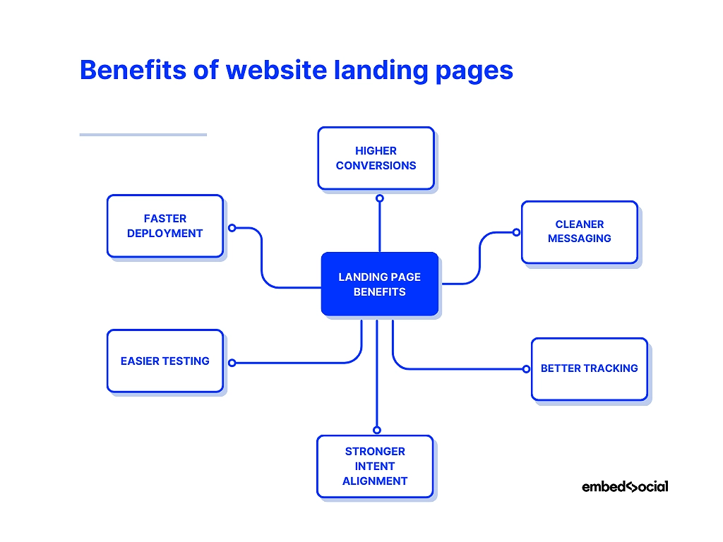
- Conversions plus élevées —un objectif unique augmente la probabilité que les visiteurs effectuent l'action souhaitée ;
- Messagerie plus claire —vous éliminez le bruit et livrez un récit cohérent du début à la fin ;
- Meilleur suivi —vous pouvez mesurer précisément les performances et optimiser chaque composant ;
- Alignement plus fort des intentions —chaque page de destination peut correspondre à une publicité, un e-mail ou un segment d'audience ;
- Des tests plus faciles —vous pouvez tester différentes variantes sans modifier votre site web principal ;
- Déploiement plus rapide —Vous pouvez créer ou mettre à jour rapidement des sections, en particulier grâce à des outils basés sur l'intelligence artificielle.
Vous ne devez jamais négliger vos pages de destination, car elles constituent vos principaux points de conversion. Vous pouvez les considérer comme les audition que vous faites devant vos clients.
Comment créer une excellente page d'accueil ? Guide étape par étape
Pour apprendre à créer une page d'accueil qui convertit, il faut définir clairement votre intention. Chaque section de la page a un rôle à jouer, et chaque rôle nécessite une approche différente.
Voici comment donner vie à votre page d'accueil en quelques étapes :
- Étape 1 : Définissez l'objectif et le public cible
- Étape 2 : Élaborez votre proposition de valeur
- Étape 3 : Concevez votre section héros et la zone au-dessus du pli
- Étape 4 : Rédiger un texte convaincant pour la page d'accueil
- Étape 5 : Créez votre mise en page, vos visuels et vos sections de contenu.
- Étape 6 : Ajoutez votre CTA et optimisez pour les appareils mobiles
- Étape 7 : Connectez les analyses, publiez et testez
Étape 1 : Définir l'objectif et le public cible
Vous ne pouvez pas commencer à construire avant de savoir exactement ce que vous voulez construire. Vous devez donc définir clairement votre objectif en vous posant les questions suivantes :
- Qu'est-ce que le Une action que cette page vise à accomplir ?
- Qui est le visiteur ? Qu'est-ce qui les a amenés ici ?
- Quelle peur, quel désir ou quelle curiosité ? Qu'apportent-ils avec eux ?
Si vous répondez à ces questions dès le début, vous pouvez créer des pages qui semblent étrangement intuitives, car elles seraient conçues pour une seule personne, et non pour tout le monde.
Exemple : Une marque de chaussures de course a découvert que ses abonnés cliquaient pour la science, et non pour le style. En réduisant l'objectif de la page d'accueil à “ Télécharger le guide d'analyse de la démarche ”, les conversions ont bondi de 421 %. La page a fonctionné parce que l'objectif était précis et que le public était bien compris.
Étape 2 : Élaborez votre proposition de valeur
“ Si vous les embrouillez, vous les perdez. ” — Donald Miller
Ce principe fondamental du branding en dit long sur l'importance d'avoir une proposition de valeur convaincante qui ne cherche pas à être poétique. Avant toute chose, Il faut que vous soyez compris !
Quel résultat promettez-vous ? Pourquoi est-ce mieux ? Pourquoi maintenant ?
Essayez d'écrire trois versions :
- Une émotion
- Une solution pratique
- Assez court pour tenir sur une carte de visite
Choisissez celui qui frappe le plus fort.
Vous pouvez également trouver des idées à l'aide d'un générateur de sections IA tel que celui d'EmbedSocial. Il suffit de lui demander de générer 10 titres parmi lesquels choisir et de les ajuster sur place.
Voici comment vous pouvez améliorer une proposition de valeur large et générique :
Ancienne version : “ La plateforme tout-en-un pour aider votre entreprise à se développer. ”
Cependant, vous devez donner à vos visiteurs une raison de soins immédiats :
Nouvelle version : “ Obtenez davantage de prospects qualifiés à partir de votre site web en 30 jours. ”
Comme vous pouvez le constater, une proposition de valeur forte est le résultat de clarté, de pertinence et de pertinence !
Étape 3 : Concevez votre section héros et la zone au-dessus de la ligne de flottaison.
Imaginez qu'un visiteur arrive sur votre page. Vous avez 3 secondes pour gagner ses 3 secondes suivantes.
Voici la section « héros » d'une page d'accueil consacrée à un produit audio :

Vous découvrez un design épuré mettant en valeur le produit en question, une offre FOMO (remise 25%) et deux CTA qui vous invitent à en savoir plus ou à acheter le produit.
Dans votre propre section « héros », vous devez répondre aux questions suivantes :
- Où suis-je ?
- À quoi cela sert-il ?
- Est-ce que c'est pour moi ?
La plupart des marques en font trop en matière de décoration. Les grandes marques simplifient. Un titre clair, une phrase d'accompagnement, un graphique d'ancrage et un seul CTA : c'est tout ce dont vous avez besoin !
Si le design n'est pas votre point fort, créer une section héros IA est un excellent point de départ. Vous pouvez ensuite modifier le texte, changer les visuels et les intégrer en quelques secondes.
Étape 4 : Rédigez un texte convaincant pour votre page d'accueil
En ce qui concerne le libellé de votre page d'accueil, posez-vous les questions suivantes :
- Est-ce que votre copier le son comme une personne, pas un comité ?
- Êtes-vous diriger en mettant l'accent sur les avantages, pas des fonctionnalités ?
- Êtes-vous répondre aux objections avant qu'elles ne soient prononcées ?
- Êtes-vous éviter les longs murs de texte qui freinent l'élan ?
- Est-ce que votre copier donner l'impression d'une conversation avec quelqu'un ?
Exemple : Une start-up proposant un service d'abonnement à des repas préparés a réécrit sa page d'accueil, passant d'une approche axée sur les fonctionnalités (“ Des repas frais livrés chaque semaine ”) à une approche axée sur les émotions (“ Ne vous demandez plus jamais ‘Qu'est-ce qu'on mange ce soir ?’ ”). Le taux d'inscription a grimpé en flèche, car le texte correspondait à la préoccupation réelle des clients.
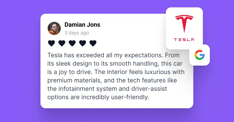
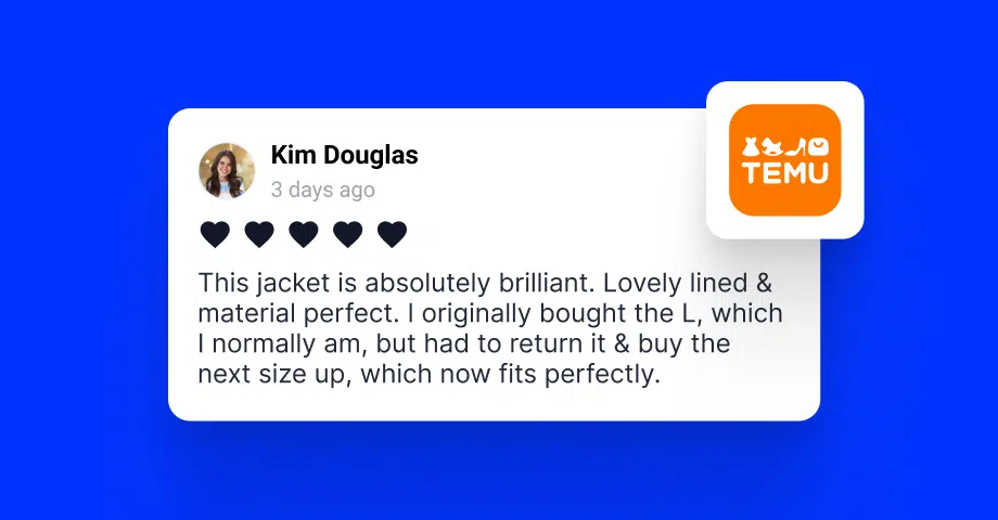
Cependant, le problème essentiel que vous essayez de résoudre est de présenter des preuves crédibles de la qualité de vos produits et services. Heureusement, avec un Plate-forme UGC Comme EmbedSocial, vous pouvez facilement recueillir des avis authentiques : revues, citations, même captures d'écran sociales.
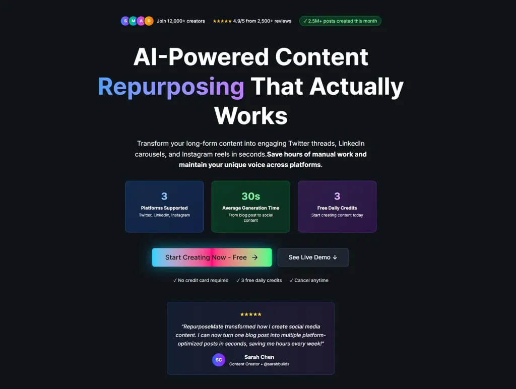
Voici comment RepurposeMate procède, avec toutes les preuves sociales dont ils ont besoin :
Étape 5 : Créez votre mise en page, vos visuels et vos sections de contenu.
Vous devez considérer votre page d'accueil comme une chorégraphie, et non comme une décoration. Chaque bloc que vous utilisez prépare le suivant, guidant l'attention de vos lecteurs vers la conviction.
Voici une structure qui fonctionne magnifiquement :
- Commencez par votre promesse – Indiquez immédiatement le résultat principal afin que les visiteurs sachent où ils se trouvent.
- Exemple : “ Obtenez deux fois plus de prospects qualifiés sur votre site web en 30 jours. ”
- Suivez avec des avantages – traduire les fonctionnalités en avantages concrets que les gens peuvent comprendre.
- Exemple : “ Passez moins de temps à rechercher des prospects, réservez automatiquement davantage de démonstrations et identifiez les pages qui génèrent réellement des conversions. ”
- Montrer comment ça marche – utilisez une procédure simple, étape par étape, ou un schéma visuel pour éliminer tout effort mental.
- Exemple : “ Connectez votre site → choisissez un modèle → publiez votre page d'accueil → commencez à collecter des prospects. ”
- Clarifier les détails – répondre aux questions courantes concernant les tarifs, les délais, les exigences ou les prochaines étapes.
- Exemple : “ Aucune carte de crédit requise. Configuration en moins de 5 minutes. Résiliable à tout moment. ”
- Éliminer les doutes – Répondez de manière proactive aux objections à l'aide de garanties, de FAQ ou de textes rassurants.
- Exemple : “ Compatible avec tous les créateurs de sites Web ” ou “ Entièrement conforme au RGPD ”.”
- Conduire à l'action – Terminez par un appel à l'action clair et convaincant qui semble être la suite logique.
- Exemple : “ Commencez gratuitement ” ou “ Créez votre section de page d'accueil dès maintenant ”.”
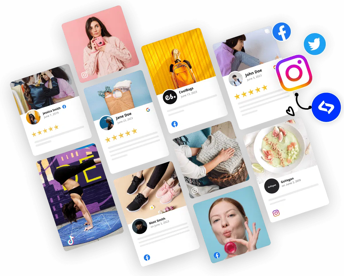
Enfin, vous devez TOUJOURS Mettez en avant les preuves sociales pour renforcer vos affirmations à l'aide de témoignages, d'avis ou de contenus générés par les utilisateurs, et instaurez la confiance. Voici comment EmbedSocial procède :
Cela peut être fait très rapidement via Widgets IA, car vous pouvez assembler votre page d'accueil à l'aide de blocs modulaires, de bandes de témoignages, de grilles visuelles, etc. Il suffit de créer une section et de passer à la suivante. Cependant, toutes doivent s'intégrer parfaitement ; ils doivent créer un ensemble cohérent.
Conseil de pro : Utilisez les espaces blancs comme de l'oxygène. Une page encombrée donne une impression de médiocrité, tandis qu'une page aérée inspire confiance.
Étape 6 : Ajoutez votre CTA et optimisez pour les appareils mobiles
Une fois votre page d'accueil créée, il est temps d'indiquer à vos visiteurs comment agir. Également appelés « appels à l'action » (CTA), ces déclencheurs de conversion sont l'objectif final, car tout le reste, de la proposition de valeur au texte et aux visuels, existe pour les soutenir.
Par conséquent, avant d'en ajouter, répondez à ces questions :
- À quoi sert une belle page d'accueil si le CTA est invisible ?
- Que se passe-t-il lorsque votre bouton se fond dans l'arrière-plan ?
- Et si votre formulaire exigeait trop, trop tôt ?
- Vos utilisateurs mobiles sont-ils obligés de pincer et zoomer jusqu'à la frustration ?
En résumé : Votre CTA doit être impossible à manquer, en phase avec l'offre sur le plan émotionnel, facile à cliquer sur un petit écran et soutenu par un formulaire fluide.
Si vous testez différents styles de CTA, vous pouvez remplacer instantanément des sections CTA entières sans avoir à reconstruire la page lorsque vous utilisez un générateur de widgets IA.
Exemple : Voici trois variantes de boutons CTA pour vous aider à déterminer celle qui fonctionne le mieux :
- CTA faible (“ En savoir plus ”)
- CTA neutre (“ Commencer ”)
- CTA fort (“ Commencer mon essai gratuit ”)
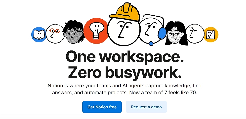
Voici comment Notion procède avec deux CTA :
Conseil de pro : Respectez ces principes fondamentaux lors de la conception de votre bouton : contraste, verbe d'actionet clarté de la valeur. Par exemple, “ Obtenez votre [service] gratuit dès aujourd'hui ! ”
Étape 7 : Connectez les outils d'analyse, publiez et testez
Une fois que vous êtes prêt à publier votre page d'accueil, vous devez envisager quelques outils d'analyse qui vous aideront à mesurer ses performances. Tenez compte des statistiques suivantes :
Entreprises qui effectuent des tests A/B structurés augmenter les conversions 27% plus rapidement en moyenne.
Ajouter cartes thermiques, mettre en place événements, suivre profondeur de défilementet observer où les utilisateurs perdent leur intérêt. Modifiez ensuite la page, et non l'ensemble du site, notamment le titre, les éléments visuels, les preuves et les CTA.
Les sections modulaires rendent cela encore plus fluide. Échangez un bloc de témoignages, remplacez une variante de héros, essayez une nouvelle mise en page, le tout sans toucher à la structure de base.
7 sections indispensables pour créer une page d'accueil à fort taux de conversion
Nous connaissons tous cette sensation. Vous arrivez sur un nouveau site web. Le produit a l'air intéressant, le texte est accrocheur, mais une petite voix dans votre tête vous demande : “ Est-ce que c'est légitime ? Est-ce que quelqu'un utilise réellement cela ? ”
Cette voix est celle de obstacle à la conversion.
Vous ne pouvez tout simplement plus vous fier à vos propres arguments marketing. Vous avez besoin que d'autres personnes vendent vos produits à votre place. C'est là qu'intervient preuve sociale et le contenu généré par l'utilisateur (CGU) Venez nous rendre visite pour convaincre les sceptiques en leur montrant que d'autres personnes ont déjà franchi le pas et ont adoré le résultat.
Alors, laissez-moi vous aider à concevoir la page d'accueil parfaite, qui génère un taux de conversion élevé. Je l'ai divisée en 7 sections essentielles, et pour chacune d'entre elles, j'ai des preuves sociales à l'appui.
Voici votre plan pour créer une page d'accueil qui inspire immédiatement confiance :
1. La section “ Héros social ”
L'objectif : Cette zone “ au-dessus du pli ” donne la première impression et explique la valeur que vous offrez. La plupart des héros échouent parce qu'ils font de grandes déclarations sans les étayer immédiatement.
L'injection de preuve sociale : Au lieu d'un simple bouton CTA, associez votre appel à l'action principal à des données statistiques immédiates ou à un indicateur de confiance de haut niveau.
[Idée de section : Héros soutenu par la confiance]
Une image dynamique en pleine largeur montrant le produit en action. Elle est surmontée d'un titre en gras (par exemple, “ Le dernier sac à dos que vous achèterez ”) et d'un sous-titre.
Sous le texte se trouve un élément lumineux et bien visible. “Bouton ” ACHETER MAINTENANT ».
Essentiellement, juste à côté ou immédiatement en dessous de ce bouton se trouve un élément widget plus petit : une rangée de cinq étoiles jaune vif à côté d'un texte en gras qui dit : “ Note de 4,9/5 basée sur plus de 12 500 avis vérifiés. ” La proximité relie l'action d'acheter à la sécurité offerte par la foule.
2. La “ barre d'autorité ” (mentions dans les médias et partenaires)
L'objectif : Avant de présenter vos produits, vous devez emprunter de l'autorité. Si le visiteur ne connaît pas votre marque, il connaît probablement Forbes, TechCrunch ou les principaux acteurs du secteur.
L'injection de preuve sociale : Cette section utilise la “ preuve sociale d'expert ”. En affichant les logos de médias reconnus qui ont parlé de vous ou de vos principaux partenaires, vous transférez instantanément une partie de leur crédibilité à votre marque.
[Idée de section : Bande d'autorité]
Une bande horizontale fine s'étendant sur toute la largeur de l'écran, avec un fond gris clair. Au centre, un petit en-tête discret indique : “ VU DANS ”.”
En dessous, six logos reconnaissables et désaturés (en niveaux de gris) sont espacés de manière régulière sur une ligne horizontale (par exemple, Forbes, Wired, The NYT, etc.). Le traitement en niveaux de gris garantit qu'ils ne détournent pas l'attention de votre contenu principal, mais qu'ils sont immédiatement reconnaissables comme des gages de confiance.
3. Section “ Produits en magasin ” avec balises UGC
L'objectif : C'est ici que se déroule le commerce. Vous présentez votre offre principale.
L'injection de preuve sociale : Les sites de commerce électronique classiques se contentent de présenter le produit sur un fond blanc. Une page d'accueil axée sur la preuve sociale montre le produit “ en situation réelle ”. Nous utiliserons des balises UGC pour montrer de vraies personnes portant ou utilisant l'article en question directement sur la fiche produit.
[Idée de section : “[Grille de produits ” Real Life »]
Une grille épurée affichant trois fiches produits.
Chaque carte comporte une photo studio de haute qualité du produit. Cependant, dans le coin inférieur gauche de l'image du produit, une photo circulaire (semblable à une bulle de profil Instagram) montre un client réel utilisant cet article. À côté de la bulle se trouve une petite étiquette indiquant son pseudonyme sur les réseaux sociaux (par exemple, “ @SarahRuns_NYC ”).
Sous le titre et le prix du produit, un petit texte indique : “ Voir 45 autres photos de cet article. ”
4. Section « Dernières actualités et contenus »
L'objectif : Pour montrer que votre marque est active, actuelle et apporte une valeur ajoutée.
L'injection de preuve sociale : Vous prouvez qu'un article de blog est bon en montrant que d'autres l'ont trouvé suffisamment intéressant pour s'y intéresser. Nous utilisons ici les “ indicateurs d'engagement ” comme preuve sociale.
[Idée de section : Flux des réseaux sociaux]
Une section à deux colonnes présentant deux articles ou mises à jour récents. Chaque colonne comporte une image, un titre et un court extrait.
Sous l'extrait, au lieu d'un simple lien “ Lire la suite ”, il y a un pied de page de preuve sociale affichant des icônes d'engagement :
- Une petite icône en forme de bulle avec le nombre “ 124 commentaires ” à côté.
- Une icône en forme de flèche avec le nombre “ 1,2 k partages ”.”
La vue de ces chiffres indique à l'utilisateur que ce contenu mérite son attention, car d'autres l'ont déjà validé.
5. Le “ Community Spotlight ” (le fil Instagram)
L'objectif : Aller au-delà des critiques individuelles sur les produits et mettre en avant le style de vie et la communauté qui entourent votre marque. Il s'agit là d'un contenu généré par les utilisateurs (UGC) pur et authentique.
L'injection de preuve sociale : Un flux en direct des publications des clients concernant votre marque à l'aide d'un hashtag dédié. Cela prouve qu'il existe une communauté dynamique et active et que les gens sont fiers d'associer publiquement votre produit à leur image.
[Idée de section : #BrandFam Grid]
Une section avec un titre amusant comme “ Rejoignez le #MyBrandLife ” et un sous-titre : “ Taguez-nous pour être mis en avant ! ”
En dessous, on trouve une grille mosaïque réactive composée de 8 images carrées provenant directement d'Instagram. Les images varient : certaines sont des selfies, d'autres des photos à plat, d'autres encore des photos d'action, mais toutes montrent clairement de vrais clients. En passant la souris sur une image, on peut voir la légende originale Instagram et le nom d'utilisateur, ce qui prouve son authenticité.
6. La section “ Témoignages approfondis ”
L'objectif : Ce classique qui renforce la confiance répond aux objections grâce aux témoignages de clients satisfaits.
L'injection de preuve sociale : Les témoignages sous forme de texte seul perdent de leur efficacité, car ils sont faciles à falsifier. Pour que cette section soit efficace aujourd'hui, vous devez pouvoir vérifier les informations qu'elle contient. Nous utiliserons des témoignages vidéo ou des avis validés par des tiers afin d'optimiser la crédibilité.
[Idée de section: Le carrousel vérifié]
Une section bien visible avec un titre : “ Ne nous croyez pas sur parole. ”
Widget carrousel horizontal comportant trois blocs distincts de témoignages.
- Bloc 1 (centre) : Une vignette vidéo avec un gros bouton “ Lecture ” sur le visage d'un client souriant. Le texte ci-dessous indique : “ REGARDER : Comment Mark a gagné 10 heures par semaine. ”
- Blocs 2 et 3 (côtés) : Témoignages textuels, mais accompagnés d'une photo de l'utilisateur, de son nom complet, de son titre/lieu de travail et, surtout, d'une petite icône verte indiquant “ Acheteur vérifié via Trustpilot ”.”
7. La section sociale finale du CTA
L'objectif : C'est au bas de la page que vous capturez le prospect ou la vente potentielle.
L'injection de preuve sociale : FOMO (Fear Of Missing Out, ou peur de passer à côté) et “ comportement grégaire ”. À ce stade final, vous souhaitez rappeler aux utilisateurs que tout le monde le fait et qu'ils sont en train de se laisser distancer.
[Idée de section: “[CTA ” Rejoignez la foule »]
Une section pleine largeur à fort contraste avec un titre imposant et accrocheur (par exemple, “ Prêt à améliorer votre flux de travail ? ”).
Un grand champ de saisie d'adresse e-mail et un bouton “ COMMENCER ”.
Juste en dessous du bouton, un widget de compteur dynamique affiche un nombre actualisé en temps réel et une déclaration à l'appui : “ Rejoignez les 85 432 spécialistes du marketing qui utilisent déjà nos outils. 145 se sont inscrits aujourd'hui ! ”
Vous pouvez créer toutes ces sections et widgets avec EmbedSocial. Utilisez simplement les descriptions ci-dessus comme aide pour créer vos propres sections sociales en quelques secondes. Cliquez ci-dessous pour commencer gratuitement.
Les éléments essentiels d'une page de destination : les éléments indispensables à toute page à fort taux de conversion
Qui ici souhaite obtenir une liste de contrôle ? Ces éléments essentiels de la page d'accueil contribuent à générer des conversions élevées, et les mettre en place correctement prépare le terrain pour tout ce qui va suivre :
| Élément | Qu'est-ce que c'est ? | Meilleures pratiques |
|---|---|---|
| Section « héros » qui communique rapidement la valeur ajoutée | La première impression de votre page d'accueil s'affiche au-dessus de la ligne de flottaison. | Utilisez une affirmation percutante, une phrase simple pour l'étayer, un visuel pertinent et un seul appel à l'action clair. |
| Un titre clair + un sous-titre convaincant | Votre titre fait la promesse ; votre sous-titre l'approfondit. | Rédigez un titre axé sur les résultats. Utilisez le sous-titre pour clarifier le principal avantage ou renforcer la crédibilité. |
| Blocs de contenu axés sur les avantages | Sections axées sur les avantages pour l'utilisateur. | Utilisez des puces courtes, des icônes ou des grilles visuelles. Mettez en avant les résultats, les transformations et les avantages. |
| Emplacement efficace des appels à l'action (CTA) | Le bouton d'action que les visiteurs utilisent pour convertir. | Placez votre CTA principal au-dessus de la ligne de flottaison et à nouveau en bas de page. Utilisez un design très contrasté et des verbes d'action. |
| Hiérarchie visuelle + mise en page facile à parcourir | La structure qui détermine la manière dont les visiteurs assimilent les informations. | Utilisez des espaces blancs, des caractères gras et des espacements clairs. Divisez les textes longs. Guidez le regard vers le bas à l'aide d'en-têtes clairs. |
| Preuve sociale (avis, contenu généré par les utilisateurs, témoignages) | Des témoignages authentiques et des preuves qui valident votre offre. | Intégrez des avis tournants, des photos UGC ou des témoignages. EmbedSocial peut automatiser tout cela ! |
| Formulaires, expérience utilisateur et principes de base relatifs à la vitesse de chargement | Les pièces fonctionnelles qui facilitent la conversion. | Rédigez des formulaires courts. Testez-les sur mobile. Compressez les images. Visez un chargement rapide à tout moment. |
Comment les marques peuvent-elles utiliser les pages de destination ? 7 meilleurs cas d'utilisation et exemples
Les pages de destination sont compact, concentréet conçu pour une tâche précise à la fois. Plus vos cas d'utilisation sont intelligents, plus ils génèrent de revenus et d'informations.
Voici 7 pages d'accueil différentes ayant chacune un objectif distinct :
1. Lancez de nouveaux produits avec un discours clair.
Au lieu d'ajouter de nouveaux produits à des pages de catalogue déjà bien remplies, les marques peuvent créer une page d'accueil dédiée au lancement qui raconte l'histoire du produit et présente ses cas d'utilisation.
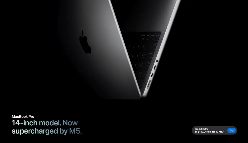
✨ Exemple : Apple lance un nouveau MacBook Pro sur une page d'accueil dédiée qui présente aux visiteurs les gains de performances, les cas d'utilisation concrets et les améliorations apportées au design, puis les oriente vers une seule action à forte intention d'achat, telle que “ Acheter ” ou “ En savoir plus ”.
2. Capturez le trafic de la campagne dans un hub contrôlé unique
Les publicités payantes, les publications sur les réseaux sociaux et les campagnes d'e-mails ont beaucoup plus d'impact lorsqu'elles redirigent les internautes vers une page spécialement conçue pour cette campagne. Une page d'accueil dédiée à la campagne permet de garantir la cohérence du message.
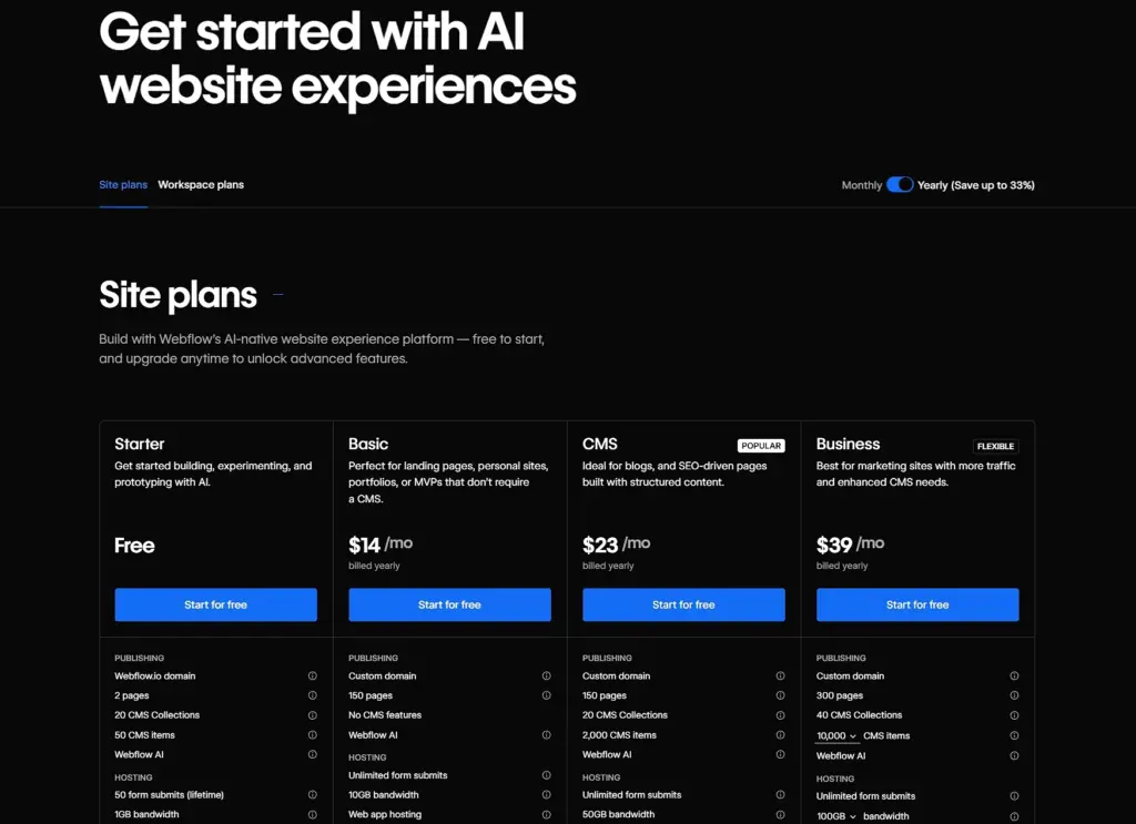
✨ Exemple : Webflow redirige les publicités payantes et les campagnes par e-mail vers une page d'accueil ciblée, conçue autour de son offre gratuite. La page présente un contenu concis (principaux avantages, comparaison simple des offres et un seul CTA “ Commencez gratuitement ”) afin que le message reste cohérent entre le clic et l'inscription.
3. Transformez la preuve sociale en moteur de conversion
Les marques peuvent transformer les éléments dispersés examens en ligne, témoignages, publications sur les réseaux sociaux et autres types de contenu généré par l'utilisateur en pages d'atterrissage dédiées et axées sur les preuves qui réchauffent rapidement le trafic froid. Grâce à des outils tels qu'EmbedSocial, ces sections restent automatiquement à jour.
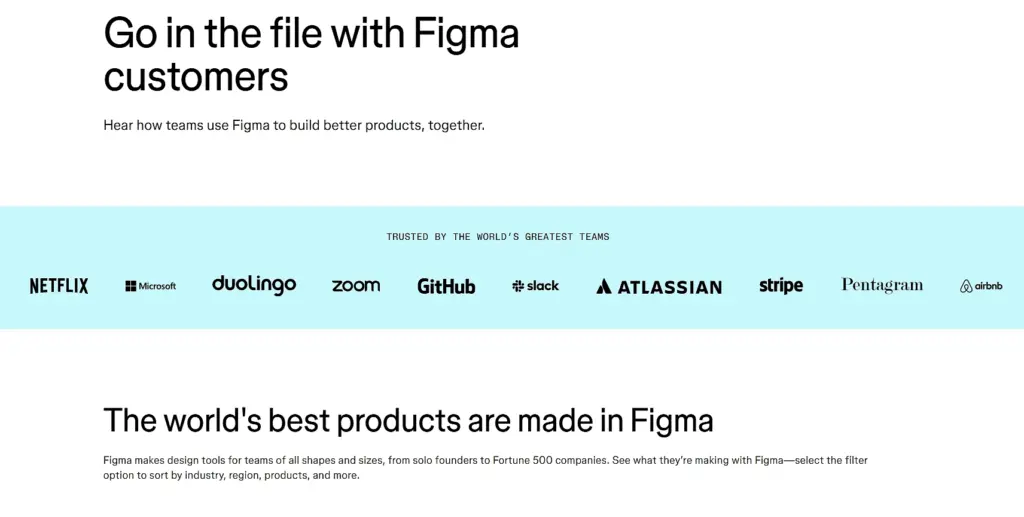
✨Exemple : Figma envoie du trafic froid vers un page d'accueil axée sur les preuves présentant des témoignages réels de clients et des marques reconnues. Au lieu de mettre en avant un argumentaire de vente, la page laisse les témoignages et les cas d'utilisation convaincre les visiteurs, qui gagnent ainsi en confiance avant même de cliquer sur “ Commencer ”.
4. Cultiver des segments d'audience spécifiques
Les pages standardisées ont rarement un impact. Les pages d'accueil segmentées permettent aux marques de s'adresser différemment aux agences, aux entreprises, aux magasins locaux ou aux nouveaux acheteurs.
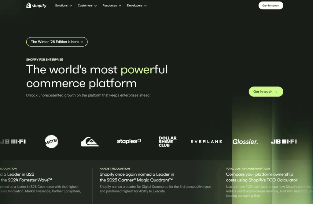
✨ Exemple : Shopify utilise des pages d'accueil segmentées pour différents publics, tels que les commerces de détail et les marques d'entreprise. Chaque page adapte les messages, les avantages et les cas d'utilisation à ce public, ce qui rend l'offre immédiatement pertinente et augmente les demandes de démonstration.
5. Mettre en place des partenariats et des offres de co-marketing
Lorsque deux marques s'associent, une page d'accueil commune permet de garantir la cohérence de l'offre et d'éviter de semer la confusion chez les visiteurs avec des messages contradictoires sur deux sites distincts.
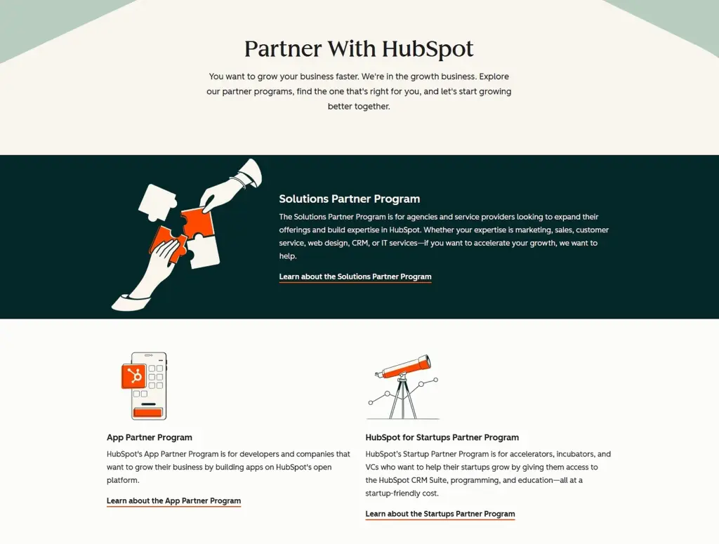
✨ Exemple : HubSpot gère un page d'accueil axée sur les partenaires avec des offres de co-marketing pour les agences. La page présente une proposition de valeur commune, des avantages partagés et un processus d'inscription unique, afin que les visiteurs comprennent clairement ce qu'ils obtiennent et qui est impliqué.
6. Créez des ressources qui se classent et convertissent à long terme.
Les pages d'atterrissage permanentes, telles que les modèles, les calculateurs ou les kits téléchargeables, peuvent être bien classées dans les résultats de recherche, générer des prospects et favoriser les inscriptions pendant des mois, voire des années, avec un minimum d'efforts supplémentaires.
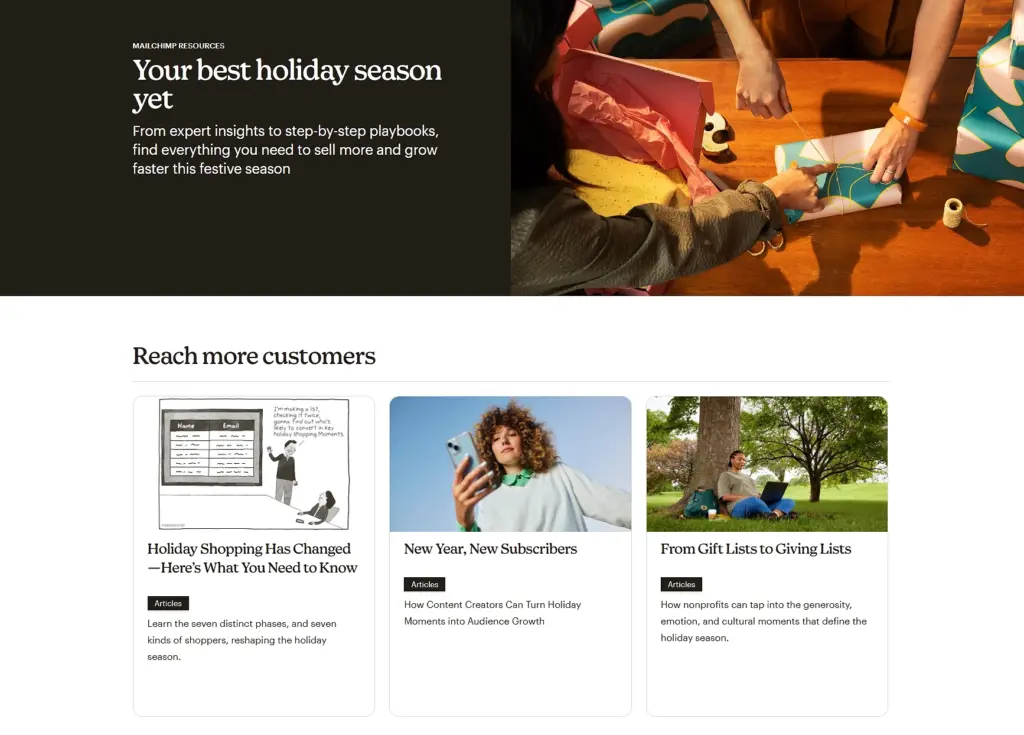
✨ Exemple : Mailchimp publie Pages d'accueil consacrées aux ressources pérennescomme ses guides et outils marketing. Ces pages sont bien classées dans les résultats de recherche, proposent des ressources téléchargeables via de simples formulaires et génèrent régulièrement des prospects qualifiés au fil du temps.
7. Réactiver et réengager les clients existants
Les campagnes de réactivation fonctionnent mieux lorsqu'elles renvoient vers une page qui donne l'impression d'un “ retour bienvenu ”, plutôt que vers un argumentaire de vente générique. Une page d'accueil de réengagement peut mettre en avant les nouveautés et expliquer pourquoi c'est le bon moment pour revenir.
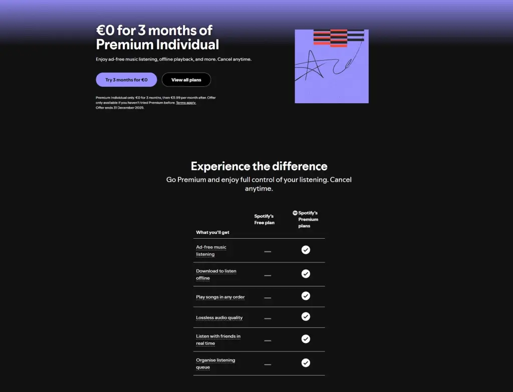
✨ Exemple : Spotify redirige les utilisateurs inactifs vers une Page d'accueil de réactivation pour leur niveau premium, en mettant en avant les nouvelles fonctionnalités et les playlists personnalisées. Au lieu d'adopter une approche commerciale agressive, la page se concentre sur les changements apportés, ce qui rend le retour opportun et intéressant.
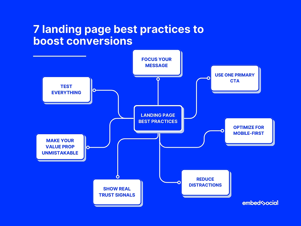
7 bonnes pratiques pour optimiser votre page d'accueil et booster vos conversions
Vous voulez vraiment apprendre à créer une page d'accueil à fort taux de conversion sans submerger le lecteur ? Alors, maîtrisez les meilleures pratiques suivantes en matière de pages d'accueil :
- Concentrez votre message: éviter l'encombrement, orienter les visiteurs vers une seule action
- Utilisez un CTA principal: répétez-le aux moments clés, veillez à la cohérence du libellé
- Optimiser pour le mobile d'abord: chargement rapide, grandes cibles tactiles, sections courtes
- Réduire les distractions: supprimer les liens concurrents, les animations et les éléments visuels perturbateurs
- Montrez des signes de confiance réels: avis, témoignages, contenu généré par les utilisateurs (EmbedSocial automatise cette tâche)
- Rendez votre proposition de valeur incontestable: clair, axé sur les résultats, spécifique
- Testez tout: titres, CTA, visuels, mises en page – et répétez souvent.
1. Veillez à ce que votre message soit clair et sans ambiguïté.
La clarté l'emporte. Une seule promesse, un seul flux et un seul récit éliminent les hésitations qui nuisent aux conversions. Ne faites pas trop de promesses.
Exemple : Une marque de fitness a réduit son titre de 17 à 6 mots et a augmenté ses inscriptions de 311 %.
2. Utilisez un seul CTA principal et rendez-le incontournable.
Plusieurs CTA créent des priorités concurrentes. Un appel à l'action dominant, répété de manière stratégique, permet de maintenir l'utilisateur sur la même voie.
Exemple : Le remplacement de deux boutons concurrents par un seul CTA “ Commencer mon essai ” a permis d'augmenter le taux d'essai SaaS de 22%.
3. Privilégiez une mise en page et des performances adaptées aux appareils mobiles.
La plupart du trafic vers les pages d'atterrissage provient des appareils mobiles. Les pages qui semblent belles sur un ordinateur de bureau sont souvent illisibles sur les petits écrans en raison de longs paragraphes, d'images trop volumineuses, de boutons minuscules, etc.
Conseil de pro : Essayez de charger votre page sur un téléphone avec une connexion 3G. Si elle semble lente ou saccadée, vos conversions le seront aussi.
4. Réduisez la charge cognitive en éliminant les distractions.
Trop d'éléments se disputent l'attention : curseurs, carrousels, fenêtres contextuelles, menus denses. Supprimer les frictions augmente les conversions de manière beaucoup plus fiable que d'ajouter davantage de “ fonctionnalités ”.”
Exemple : Une entreprise de coaching a supprimé sa barre de navigation fixe sur ses pages d'accueil et a constaté une augmentation de 191 % du nombre de formulaires de réservation remplis.
5. Renforcez votre crédibilité grâce à des témoignages clients authentiques
Les visiteurs font confiance aux personnes, pas aux marques. Par conséquent, examens en ligne, témoignages, classement par étoiles, les photos et les contenus générés par les utilisateurs renforcent la confiance et réduisent l'appréhension liée à l'achat.
Vous pouvez automatiser la preuve sociale dynamique à l'aide d'outils tels qu'EmbedSocial, qui rassemble les avis, les publications UGC et les témoignages afin que votre page d'accueil soit toujours vivante et inspirant confiance.
6. Formulez une proposition de valeur audacieuse, précise et sans équivoque.
Un titre vague ou générique oblige les visiteurs à deviner ce que vous proposez, et la plupart ne le feront pas. Une promesse claire et axée sur les résultats stimule instantanément l'engagement.
Exemple : “ Nous aidons les entreprises à se développer ” → ignoré, alors que “ Obtenez deux fois plus de démonstrations qualifiées en 30 jours ” → convaincant.
7. Testez différentes variantes et suivez les performances en continu.
Les pages d'atterrissage les plus performantes ne sont jamais statiques. Titres, visuels, CTA, mises en page : de petits ajustements peuvent apporter des améliorations majeures. Vous devez donc tester les performances de votre page d'atterrissage après l'avoir créée à l'aide de Google Analytics et d'outils similaires.
Exemple : Une marque spécialisée dans l'apprentissage des langues a découvert que le fait de remplacer l'image principale de son interface produit par celle d'un utilisateur souriant avait permis d'augmenter les conversions de 141 %.
Exemples de pages d'atterrissage qui illustrent ce qui fonctionne
Voici trois exemples parfaits qui vous montrent comment créer une excellente page d'accueil qui semble intentionnelle, persuasive et axée sur la conversion dans différents créneaux :
1. Exemple SaaS : page d'accueil Calendly
Page d'accueil principale de Calendly est un exemple type d'expérience d'atterrissage axée sur l'inscription à un service SaaS. Elle s'ouvre sur un titre en gras qui annonce le résultat (une planification facile sans va-et-vient), soutenu par un sous-titre concis qui explique la valeur ajoutée.
Le CTA principal (“ Inscrivez-vous gratuitement ”) est placé bien en évidence au-dessus de la ligne de flottaison, sans aucune distraction. En faisant défiler la page vers le bas, les principaux avantages sont présentés dans des sections claires, des visuels simples illustrent le fonctionnement du produit, et des témoignages sociaux ainsi que des logos de clients sont intégrés.
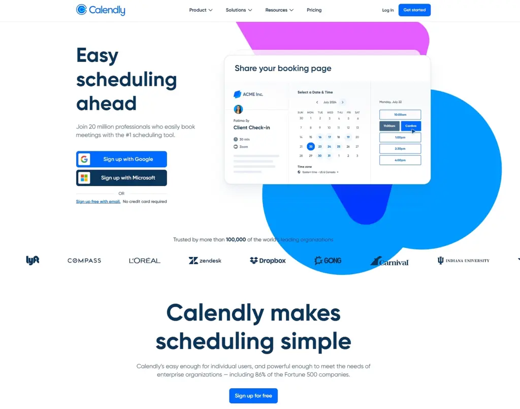
Ce qui fonctionne ici :
- Un titre axé sur la valeur qui explique instantanément l'avantage principal
- Un CTA clair et visible dès le premier coup d'œil qui élimine toute hésitation (“ Inscrivez-vous gratuitement ”).
- Blocs d'avantages présentés de manière lisible
- Éléments de preuve intégrés qui renforcent la crédibilité sans encombrer
Vous pouvez ouvrir la page, faire défiler les sections « héros », « avantages » et « preuves », puis faire une capture d'écran des parties qui illustrent le mieux la clarté de la page d'accueil SaaS, la communication des avantages et la conception axée sur la conversion afin de vous en inspirer pour votre blog.
2. Exemple de commerce électronique : page d'accueil HelloFresh
HelloFresh utilise des visuels audacieux et colorés, des textes axés sur la valeur ajoutée et un processus d'inscription fluide. La page met en avant des avantages clairs avec des chiffres concrets (“ 91% de nos clients se sentent en meilleure santé ”, “ 93% de nos clients se sentent moins stressés ”), avant de renvoyer vers un court guide vidéo. Les images illustrant le mode de vie renforcent l'attrait émotionnel tout en conservant une mise en page épurée :
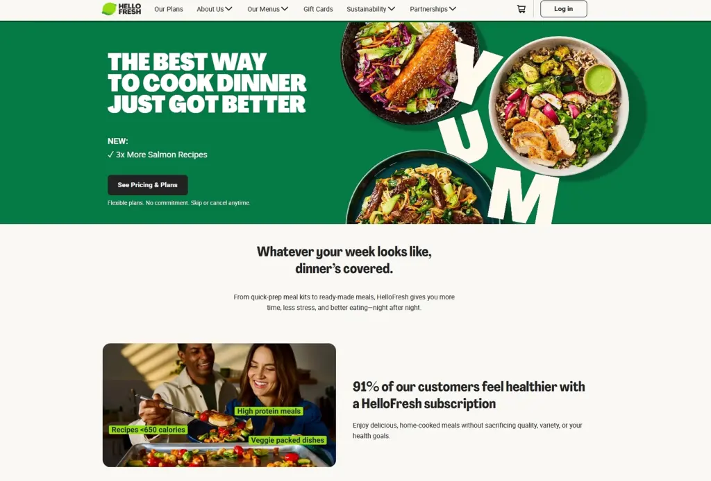
Ce qui fonctionne ici :
- Des visuels produits percutants qui suscitent le désir
- Messages axés sur les avantages qui répondent aux besoins réels des utilisateurs
- Structure simple, étape par étape, guidant les utilisateurs vers la conversion
3. Exemple d'entreprise de services : page d'accueil Interflora
Page d'accueil d'Interflora excelle en matière de clarté du service. Il s'ouvre sur un accroche visuelle émotionnelle (de magnifiques compositions florales), propose une navigation simple par catégories et conserve l'accès au service principal (livraison de fleurs) en haut de la page. Sa crédibilité est également renforcée par les avis en ligne :
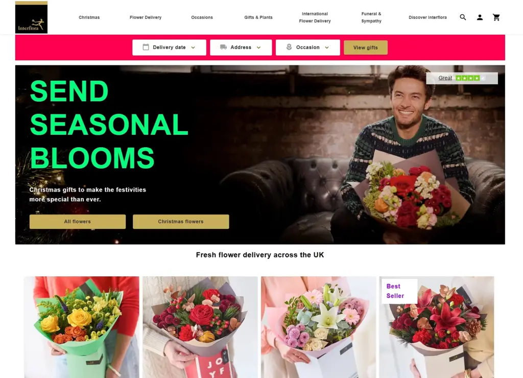
Ce qui fonctionne ici :
- Récit émotionnel à travers l'imagerie
- Catégories de services claires et intuitives
- Des marqueurs de confiance subtils qui atténuent les hésitations
Comment créer une section de page d'accueil via EmbedSocial ?
Vous n'avez pas besoin du meilleur créateur de pages de destination pour créer des pages de destination à fort taux de conversion. Souvent, ce sont les sections individuelles qui font la différence : un héros plus fort, un bloc CTA plus clair ou une meilleure preuve sociale. C'est exactement là que notre créateur de pages de destination entre en jeu.
Avec Le site Web d'EmbedSocial Générateur de pages d'atterrissage IA, vous pouvez créer et intégrer des sections de pages d'atterrissage (blocs héros, bandes de témoignages, sections CTA, grilles visuelles, etc.) directement dans n'importe quelle page web existante, sans avoir à repenser l'ensemble de la page.
Voici comment cela fonctionne :
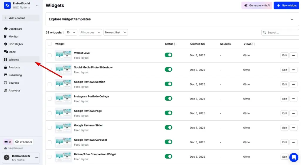
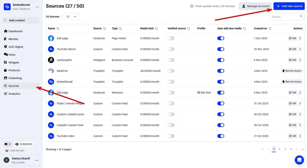
Étape 1 : Accédez à la section ‘ Widgets ’ dans EmbedSocial.
Commencez par vous connecter à votre compte EmbedSocial ou Activer un essai gratuit. Dans le menu de gauche, ouvrez le Section Widgets, où toutes les sections de la page d'accueil sont créées et gérées :
Cette approche fonctionne aussi bien pour améliorer la page d'accueil d'un site Web existant que pour ajouter de nouvelles sections axées sur la conversion à une page de campagne.
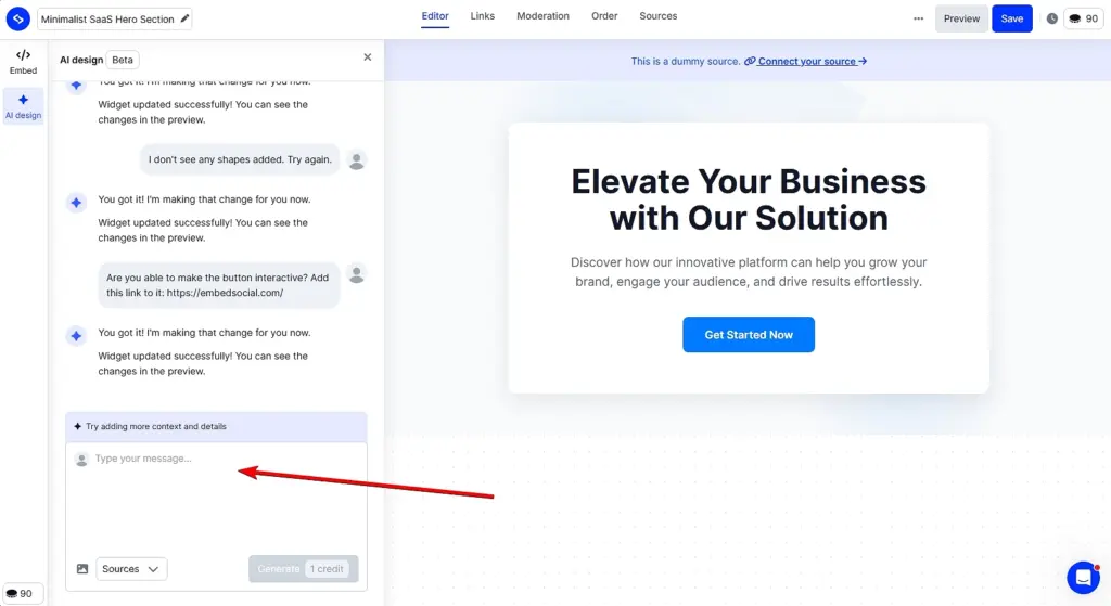
Étape 2 : Décrivez la section de la page d'accueil que vous souhaitez créer.
Cliquez sur Générer avec l'IA (coin supérieur droit) pour ouvrir l'éditeur de widget. Ici, il vous suffit de décrire la section souhaitée, telle qu'une section héros, un bloc CTA ou une mise en page de témoignage, et, si vous le souhaitez, de télécharger une image pour donner un contexte visuel à l'IA.
Une fois votre invite prête, cliquez sur Générer. Chaque invite utilise un crédit et génère une section de page d'accueil prête à l'emploi que vous pouvez affiner davantage :
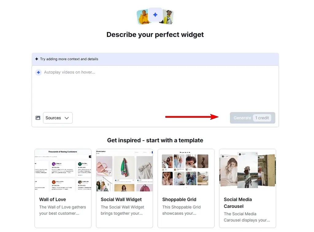
Si vous ne savez pas par où commencer, vous pouvez sélectionner l'un des modèles intégrés et le personnaliser au lieu d'écrire une invite à partir de zéro.
Facultatif : connectez le contenu généré par les utilisateurs (UGC) ou les avis pour les sections consacrées aux preuves sociales.
Si votre section de page d'accueil inclut des preuves sociales, ce qui est l'une des meilleures pratiques les plus efficaces en matière de page d'accueil, vous pouvez connecter vos sources de CGU ou d'avis sous la rubrique Sources d'information tabulation :
Cela vous permet d'obtenir des avis authentiques, témoignages, ou les publications UGC, et utilisez-les de manière dynamique dans votre section principale, votre bloc de preuves ou votre carrousel de témoignages.
Étape 3 : Affinez la section jusqu'à ce qu'elle s'adapte parfaitement à votre page d'accueil.
Vous pouvez continuer à ajuster la section générée en relançant l'éditeur. Modifiez les titres, les mises en page, les visuels, les CTA, ou même changez la source UGC connectée :
Cette flexibilité permet d'expérimenter facilement différentes variantes lors de l'apprentissage de la création d'une page d'accueil qui convertit, sans toucher au code ni reconstruire la page.
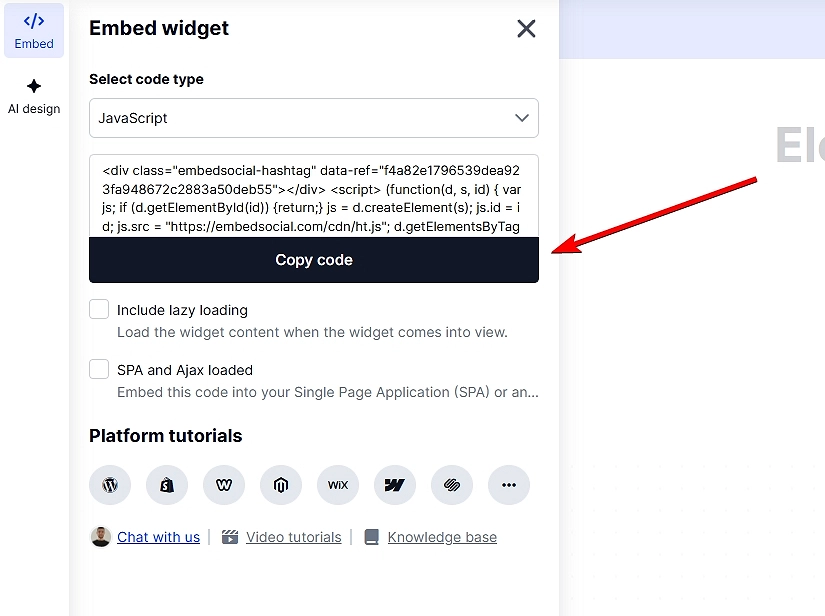
Étape 4 : Intégrez la section dans votre page d'accueil.
Une fois que vous êtes satisfait du résultat, ouvrez le fichier Onglet Intégrer dans l'éditeur de widget et copiez le code d'intégration. Collez-le à l'endroit souhaité sur votre page web (WordPress, Webflow, Shopify ou tout autre site prenant en charge le langage HTML) et publiez-le :
Problèmes courants à surveiller lors de la création de sections de pages de destination
Lorsque vous générez et intégrez des sections, veillez à :
- des titres faibles ou vagues qui ne communiquent pas la valeur,
- des visuels surchargés qui détournent l'attention du message principal,
- plusieurs CTA rivalisant pour attirer l'attention,
- une mauvaise réactivité des téléphones portables,
- image de marque ou typographie incohérente.
Il suffit d'utiliser EmbedSocial réfléchissez bien à chaque section spécifique, car cela vous donne la liberté de mettre à niveau, tester et optimiser les pages de destination sans repartir de zéro.
Pourquoi choisir EmbedSocial comme outil de création de pages d'accueil IA ?
Les pages de destination évoluent, et plutôt que de reconstruire des pages entières à l'aide d'outils rigides, les équipes modernes se concentrent sur l'amélioration des sections qui influencent réellement les conversions, telles que les blocs héros, les CTA, les preuves sociales et le contenu axé sur les avantages. C'est exactement là où EmbedSocial convient.

Plutôt que d'agir comme un éditeur de page traditionnel, EmbedSocial fonctionne comme un générateur de pages d'atterrissage alimenté par l'IA pour les sections, aidant les marques à concevoir, générer et intégrer des éléments de pages d'atterrissage à fort taux de conversion sur n'importe quel site, à l'aide des outils auxquels elles ont déjà recours.
- Construisez les pages d'atterrissage section par section : générer des blocs héros, des CTA, des sections de témoignages, des galeries UGC et des grilles d'avantages sans avoir à reconstruire des pages entières ;
- Utilisez l'IA pour générer des sections prêtes à la conversion : Le générateur de pages d'atterrissage IA crée des mises en page, des titres et des CTA conformes aux meilleures pratiques en matière de pages d'atterrissage.;
- Agissez comme un créateur de pages d'atterrissage flexible, et non comme un éditeur verrouillé : intégrer des sections dans n'importe quel site web, CMS ou constructeur de pages d'atterrissage que vous utilisez déjà ;
- Concevez comme un concepteur de pages d'atterrissage, sans compétences en conception : ajuster l'espacement, la typographie, les visuels et l'image de marque tout en conservant la structure guidée par l'IA ;
- Choisissez parmi une multitude de modèles de pages d'accueil : Le processus de conception d'une page d'accueil EmbedSocial commence par le choix de la mise en page de votre page d'accueil.
- Transformez la preuve sociale en un atout de conversion en direct : rassemblez des avis, des témoignages et du contenu généré par les utilisateurs qui se mettent à jour automatiquement au lieu de rester statiques ;
- Fonctionne avec n'importe quel générateur de page d'accueil existant : Ajoutez des sections EmbedSocial à Webflow, WordPress, Shopify, Wix ou à des sites Web personnalisés à l'aide d'un simple code d'intégration.;
- Optimisez et itérez plus rapidement : Échangez des sections individuelles pour tester les messages, les mises en page ou les CTA sans toucher au reste de la page.
EmbedSocial ne cherche pas à remplacer tous les créateurs de pages d'atterrissage. Il est conçu pour améliorer la conversion des éléments les plus importants de vos pages d'atterrissage, de manière plus rapide, plus intelligente et grâce à l'intelligence artificielle. Alors, si vous souhaitez créer des pages d'atterrissage qui convertissent plus rapidement, essayez notre outil !
Conclusion : utilisez l'IA pour créer des pages d'atterrissage qui convertissent en 2026 !
Si vous souhaitez créer la meilleure page d'accueil possible pour votre site web, vous devez réfléchir à la structure, à la clarté et à l'intention liées à ce que vous essayez de vendre ou d'accomplir.
Lorsque vous comprenez comment créer une page d'atterrissage qui s'adresse à un seul public, un seul message et une seule action, vos résultats commencent à évoluer rapidement. Et lorsque vous appliquez les meilleures pratiques éprouvées en matière de pages de destination que j'ai décrites ci-dessus, votre page devient un système de conversion vivant.
Quel que soit le créateur de page d'atterrissage que vous utilisez, les principes fondamentaux restent les mêmes : Communiquez rapidement votre valeur ajoutée et guidez vos visiteurs grâce à un flux visuel clair.. De plus, pour renforcer la confiance, vous devez supprimer tout ce qui ralentit le moment de la conversion.
Inutile de dire que si vous souhaitez créer des pages d'atterrissage plus efficaces sans repartir de zéro, essayez Le site Web d'EmbedSocial Générateur de sections pour pages d'accueil IA et création de blocs héros, CTA, témoignages et sections de preuves soignés que vous pouvez intégrer à n'importe quel site web en quelques minutes.
Essayer Widgets IA pour sites web d'EmbedSocial tout de suite !
FAQ sur la création d'une page d'accueil
Comment créer une page d'accueil pour les débutants ?
Pour créer une page d'accueil en tant que débutant, vous devez Commencez par une structure simple : un titre clair, une section sur les avantages, une preuve sociale et un seul CTA.
Vous pouvez utiliser n'importe quel outil de création de page d'accueil avec lequel vous vous sentez à l'aise, puis renforcer votre crédibilité à l'aide d'avis ou de témoignages. Des outils tels que EmbedSocial Permettre aux débutants d'utiliser l'IA pour concevoir et insérer des sections héros et des blocs de preuve prêts à l'emploi sur n'importe quel site sans avoir besoin de compétences en conception.
Quelle est la différence entre une page Web et une page de destination ?
Une page web comporte plusieurs objectifs et liens, tandis qu'une page de destination se concentre sur une seule action, telle que s'inscrire, acheter, livreou télécharger. Les pages de destination éliminent les distractions, afin que les visiteurs progressent sans encombre vers cet objectif. Elles sont également plus faciles à optimiser à l'aide de blocs de contenu modulaires, tels que des sections de preuve ou d'appel à l'action créées avec EmbedSocial.
Quel est le meilleur outil pour créer une page d'accueil ?
Tout dépend de vos besoins : Wix et Leadpages sont simples, tandis qu'Unbounce est idéal pour les tests. Quel que soit votre choix, vous pouvez améliorer n'importe quel constructeur en ajoutant EmbedSocial. Widgets AI UGC qui peuvent remplacer n'importe quelle section de votre page d'accueil, comme vos sections principales, vos CTA, vos sections de témoignages et autres widgets de preuve sociale.
Quelles sont les caractéristiques d'une bonne page d'accueil ?
Une bonne page d'accueil offre une promesse forte grâce à un design épuré, un CTA clair, une mise en page adaptée aux mobiles et des témoignages clients authentiques. C'est la combinaison de la clarté et de la confiance qui stimule les conversions. De plus, l'ajout de widgets UGC dynamiques, comme celles d'EmbedSocial, font souvent la différence.
Qu'est-ce qui fait qu'une page d'atterrissage convertit bien ?
Des messages clairs, un chargement rapide, une mise en page facile à parcourir et des signaux de confiance contribuent tous à augmenter les conversions. Les visiteurs doivent comprendre l'offre en quelques secondes. De nombreuses marques améliorent considérablement leurs conversions en ajoutant des widgets de preuve sociale, car ceux-ci offrent des signaux de confiance provenant de tiers.
Quelle doit être la longueur d'une page d'atterrissage ?
Tant qu'il est nécessaire d'expliquer l'offre, et pas plus. Les offres simples se convertissent bien avec des pages courtes ; les produits coûteux ou complexes nécessitent souvent plus de preuves et de détails. Sections modulaires générées via EmbedSocial peut vous aider à allonger ou raccourcir votre page sans avoir à la reconstruire.
Les pages d'atterrissage ont-elles besoin d'un référencement naturel (SEO) ?
Le référencement naturel (SEO) est utile si votre page d'accueil cible l'intention de recherche ou le trafic permanent. Pour les pages de campagne, le trafic payant ou provenant des e-mails est plus important que le classement. Vous pouvez toujours ajouter des preuves structurées, des FAQ ou des sections de contenu à l'aide de EmbedSocial pour rendre la page plus utile et mieux alignée sur les mots-clés.
Puis-je créer une page d'accueil sans codage ?
Oui. La plupart des créateurs de pages d'atterrissage fonctionnent entièrement par glisser-déposer. Même si vous avez déjà un site web, vous pouvez ajouter des sections hero, des CTA, des témoignages et des blocs UGC sans toucher au code à l'aide de Le site Web d'EmbedSocial Composants générés par l'IA.