Important note: This method is not working at the moment and we are working on a new form builder that is coming soon. Please contact our customer success team for more information.
Before going into more details, let’s just describe what is a multi-step form with a slider layout:
‘We’ve created a new format called Slider that transforms any vertical long-form in a multi-step form, with the main purpose to make the forms more interactive, appeal shorter and have the ability to blend in any landing page’
Kate Bojkov, Product Owner.
The goal of the multi-step forms is to split longer forms in such a way that each question will be presented separately. The users navigate through questions by clicking on the “next” button and they can go back to a question by clicking on the “previous” button. This type of question display is beneficial for collecting information in a logical order, increasing users’ concentration, and fits more with modern website layouts.
If you are looking for a quick and easy way to create and embed a multi-step form on your website we outlined a detailed tutorial on how you can do this.
First, log in or create a free EmbedSocial account (if you still don’t have an account), then follow these steps
- Navigate to the Forms page
- Choose existing form or create a new form
- On the left sidebar click on Layout & Themes and choose Slider
- Click Save and Publish
You can share the form link so people can access the slider form or you can embed the form in an interactive forms widget.
To create a widget, follow these steps:
- Click on Widgets and choose how you want the form to appear: inline section, floater, button or banner
- Click Save and copy the widget code
- Paste the code in the part of the website where you want the form to appear
That’s it. For a more detailed step-by-step tutorial so you can watch the video below:
As you can see there is no need to create a full form by yourself. However, if you want the form design to fully suit the front-end of your website, EmbedFroms offers a custom CSS option to change the fonts, for example. You can also use other customization options and change the submit button’s copy and add a logo and layout.
Here is a demo of form in a slider layout:
The form can be embedded on any landing page be it checkout, or the home page, built with any web builder like WordPress, Duda, or Wix.
The best part? No need for plug-ins and it’s completely free.
Multi-step Forms Best Practices
According to the study “Testing 2-Step vs. 1-Step Conversion Forms,” forms with multiple steps have 14% higher form conversions than the one-step long forms.
However, there are still a few simple principles you need to keep in mind when creating multi-step online forms to get the highest conversion rates.
Separate questions in a logical order
The question order can directly impact the respondents’ answers. That’s why logically ordered questions are important when it comes to designing forms. The best way to decrease friction in the form filling process is to ask the most important questions first and group fields in a logical order.
For example, if you have more fields asking for contact information like phone number and email address then those fields should be ordered by priority and follow each other in an intuitive order. Many form builders have a drag and drop option for simple and quick question rearrangement.
Show progress
Uncertainty about how many more questions are left can cause friction in the multi-step forms. A good rule of thumb is to use a progress bar or any type of indicator that will show users they have left to finish the form.
In EmbedForms each question has functionality that says “question 2 of 15” to indicate to the respondents how many more questions remain.
Include thank-you page
Thank you pages are great for showing your appreciation, but also for reassuring users that their submission is successful. If for some reason you want to navigate respondents to your own thank you page after submitting the form, you can use the re-direct link option.
A/B test the forms
Form builders are great for form testing without the risk of technical issues. The A/B testing is super easy with form builders. You can test the form length, design, CTA button copy and see which form design increases conversions. With EmbedForms you can duplicate the same form with a different design or widget and test which one will get more respondents.
Benefits of Using Multiple-Step Forms
Lower friction
Psychologically multiple-step forms have a better impact on the respondents’ intent to finish the form.
First, every time respondents click on the next button there is a slightly bigger intensity in users’ aim to finish the form.
Second, this type of form filling increases our focus since we need to concentrate on one question at a time.
Mobile-friendly
Multi-step forms are easier to be filled out from a mobile device. Compared to single-step forms, multip-step forms are much easier to complete since only one question pop-up on the mobile screens. This way, you can significantly improve the user experience as well.
Engaging
Multi-step forms are strategically designed to increase user engagement.
These types of forms are less overwhelming since the user has to answer only one question at a time and click “next” to get to the next question.
Visually appealing
Multi-step forms take a lesser place on your website and don’t evoke an overwhelming feeling when users need to fill them out.
Multi-Step Forms or Single-Step Forms
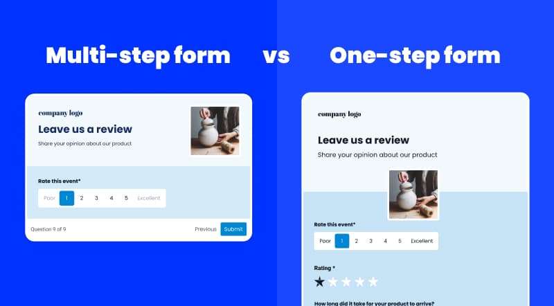
Multi-page forms or single-step forms? Which one to choose?
Multi-step forms are great when you need a lot of information from your users. So far we have seen that splitting the long forms per question reduces the frustration and increases the intention of the users to fill it out.
But if you need a little user data and want to just embed a simple contact form, lead generation, or registration form, then single-step forms can get the job done.
Wrapping up
Multi-step forms offer you the benefit of better question display and increased users’ focus.
With EmbedForms, anyone can create an unlimited number of multi-step forms in just a few clicks and embed the forms on any webpage they want.


