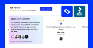
We are happy to announce that today we are launching an entire re-design of our reviews and testimonial widgets.
In the following text, we will describe the process and showcase the new widgets that you can start using right now.
The Inspiration: Customers needs to drive our roadmap
From the very beginnings of building EmbedSocial, our top priority is to listen to our clients’ feedback and requests and implement their wants into our development roadmap.
One of the core features we’ve developed together is the ease of showing a widget with social reviews on any website, which any user can do, no coding required.
But as the widgets evolved with new features and new customer segments got to adopt our products, the need for a variety of widgets arose:
“The functionality of the platform is awesome, however, the layouts can use a little bit of improvement. I hope they could be more advanced and simple at the same time”, says a user from the USA.
One of the frequent requests has been to simplify our reviews and testimonials widgets by improving users’ UI experience.
So, today, we are excited to show you what we’ve been working for the past few months.
5 New Reviews Widgets!
We made a complete facelift of the review widgets’ code, design, layouts, and appeal.
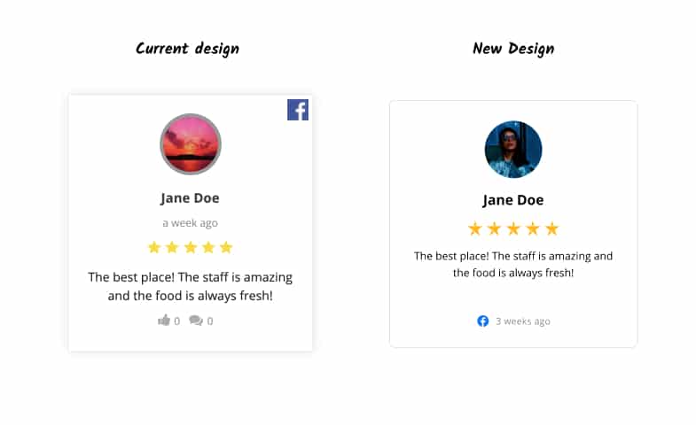
So here is how we approached the entire process:
We made them simpler and responsive so they will fit any design or any website by default.
On the other hand, if you do need to make adjustments, our code and CSS classes are now simpler to use and you will be able to use the Custom CSS option very, very easily.
We hope that the launch of our new review layouts will keep the technical things as simple as possible while making sure that our customers enjoy more flexibility in what is displayed on their websites.
Early comments are mostly positive:
“Love the design and format. This kind of layout inspires me to write a review. So valuable!”, says a user from Tokyo.
Comments like these just confirm that we are on the right track.
Continue reading to discover how it was like behind the scenes, learn how we managed to solve some design challenges and make sure to check the new widget demos.
Behind the scene: The re-design process
Customer reviews are becoming one of the main decision making triggers when people decide to buy a product.
And capturing positive reviews is becoming really challenging as consumers become more educated and continue to demand superior products and services.
As you probably know or (maybe not), EmbedSocial’s main purpose is to capture, bring your social reviews and customer testimonials to life on your website.
We do this, by direct integration with the main social networks and sync the generated reviews in real-time on your website with highly interactive widgets.
A complex process we try to fix, right?
Well, we believe in the power of true social proof. This is why we believe that showcasing it in the most simple but emphasized format will add an extra value to our users.
So that is why we’ve accepted the challenge, led by our hyper-creative product designer Angela Ristovska and our Customer Success Team.

Here is how the entire process looked like:
- Brainstorm meetings with Customer support team
- Analyze customer feedback, needs and wants
- Make a list of the major wants and needs of the platform
- Define atomic design components
- Create and present first drafts
- Make (more than a few) adjustments of the drafts
- Incorporate CSS and HTML
- Test, test, test
- Launch
Check below the main deliverables of this process:
Design components of the new widgets
For more than 3 months, we focused our efforts on recreating our review widgets that you will LOVE to embed on your websites.
Here are the main re-design elements:
- Star redesign
- Atomic components design of the widgets
- Themes of the widgets
Each of these design elements has its own story.
Here are the details:
Reinventing the… star!
You might ask why we reached for the star at first.
Well, we believe that the core concept of a customer testimonial is the 5-star symbol.
In simple terms, if you have a text is just a paragraph, but if you add the stars alongside …. (Tadaam!) it becomes a testimonial.
So, the stars actually make this format what it is. Without it, it’s just a quote or a paragraph.
And we really wanted to come up with our own stars.
So, after a couple of hours spent in brainstorming, our team decided to make a branded EmbedSocial star design.
We wanted the star to indicate the EMBED symbolism, which as a verb, means: fix (an object) firmly and deeply in a surrounding mass.
This is exactly what we want you to do with your customer testimonials – make them an essential part of your website.
In case you notice some similarity between the EmbedSocial logo and our new stars design, you are not alone.
This analogy is not an accident:
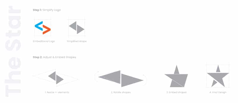
We fell in love with our brand-new stars, so we applied them to all of our widgets.
The results: Fresh look and widget that makes the customer’s voice stand out.
Mission complete 🙂
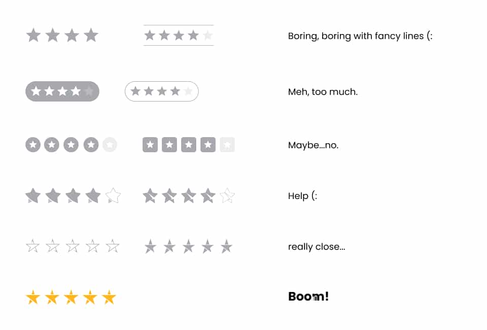
The road to coming up with such a lovely star design was filled with trying and failing before we developed a design that caught our breath.
Here are some of the designs that we have considered:
Widgets design components
Even though we decided to do just an uplift of the current layouts, we knew that the process wouldn’t be easy at all.
Redesigning is a creative process, and it’s really easy to go from uplift to inventing the new Tesla car. To make sure to keep our eyes on the prize, we’ve created a list of goals, priorities, and basics we need to follow during this project:
- Keep it simple!
- Follow Atomic design principles
- Create a system of components for every widget in Figma with a new (simple) design.
- Implement components using HTML, CSS, and JS – Clean code, new naming of the classes, easy-to-apply custom CSS.
- Test new widgets
And so, the journey began.
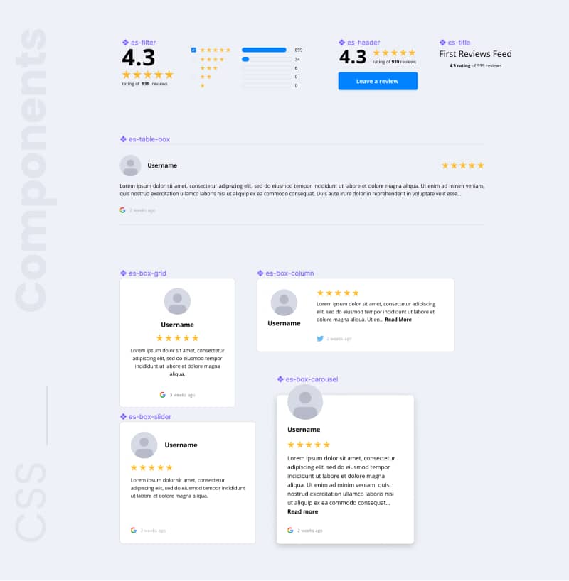
Defining a simple set of components as a design system helps us make a firm statement of what are the main elements of each widget and helped us define all major CSS classes, making the design and its implementation very easy.
As a summary here are the most used components in each widget:
From component to widget, trough looong working days and pain, it’s official… They are live!
Hard work paid off! We made modern and responsive widgets to fit any design or any website by default.
Widget themes
As a result of the above process, we believe that once you create and embed any of the new widgets, you will not need to customize it furthermore, (hopefully) thus helping you save time and efforts to focus more on your day to day activities.
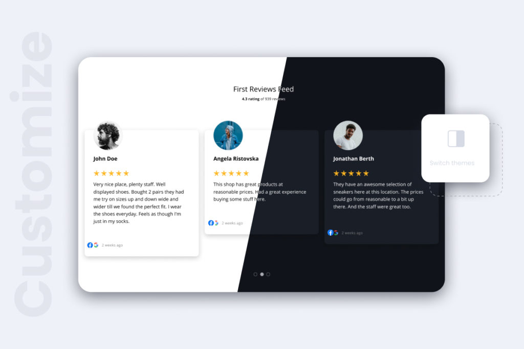
The themes will help you to make a quick switch between dark or white layouts, in just one click:
On the other hand, if you do need to make adjustments, our code and CSS classes are now simpler to use and you will be able to use the custom CSS option very, very easily.
New widgets showcase
And finally, the design is conceptualized with the two main elements of EmbedSocial branding:
- The unifying code tag that represents the embedded part of the brand
- The symbol of a relationship that our users want to build with their customers
We believe that this change refreshes the looks of the widgets and stays behind the brand to represent the undeniable power of the user feedback.
So finally, here are the new widgets:
Grid Widget
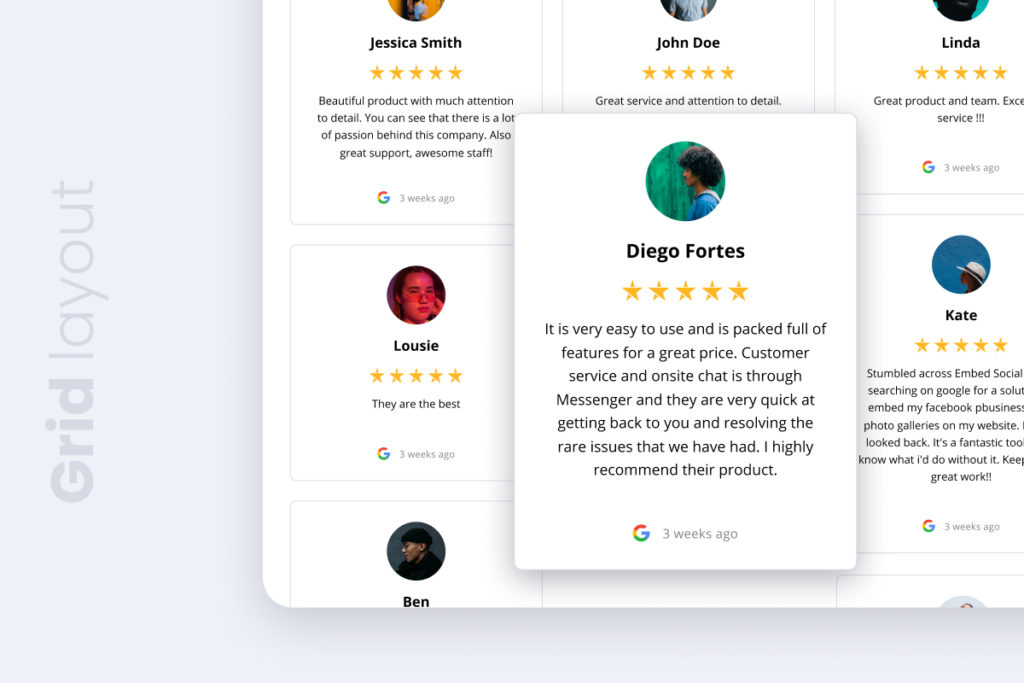
The Grid widget showcases social reviews in a responsive masonry that simulates a modern grid layout that fits any full page where you want to display as many reviews as possible.
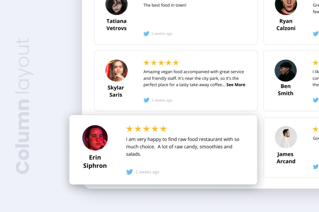
Column Widget
A two-column layout perfect for full-screen pages, to display multiple reviews on one page.
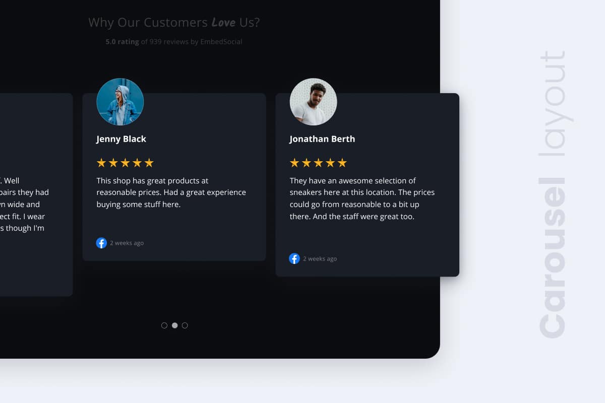
Carousel Widget
The slider will show your reviews in an autoplay format perfect for your homepage. You can view the reviews, by clicking a box that will popup the review in a slider lightbox or a vertical fixed slider.
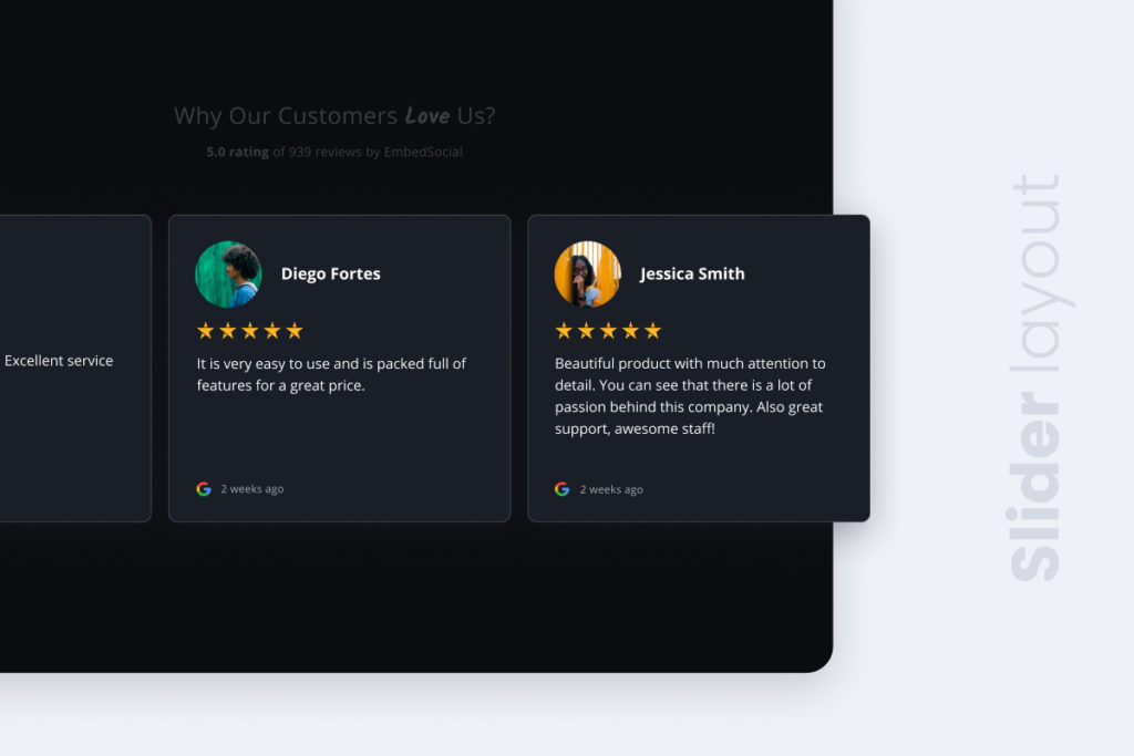
Slider widget
Very similar to the carousel widget with slight changes in the design and a flat look for website designs that are minimalistic.
Page widget
We named this layout ‘Page’ as it acts as a full reviews page, with buttons and filters that make the webpage fully advance to display user reviews. It is designed for product pages mostly, where users can use additional options to search and filter the provided reviews.
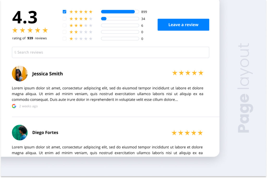
Table Widget
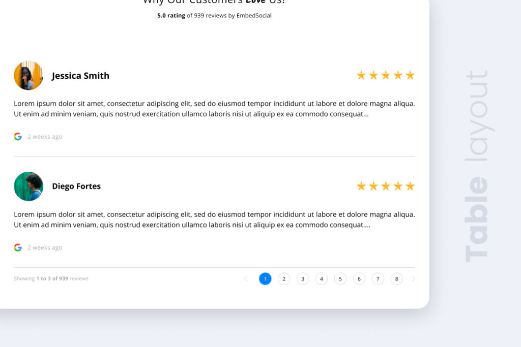
In the end, if you need a more simplified version of the Page layout, that will not include the filters and the search field, you can use the Table layout, which displays I full list of the reviews in a table format, similar to an Amazon-like reviews section.
Popup Widget
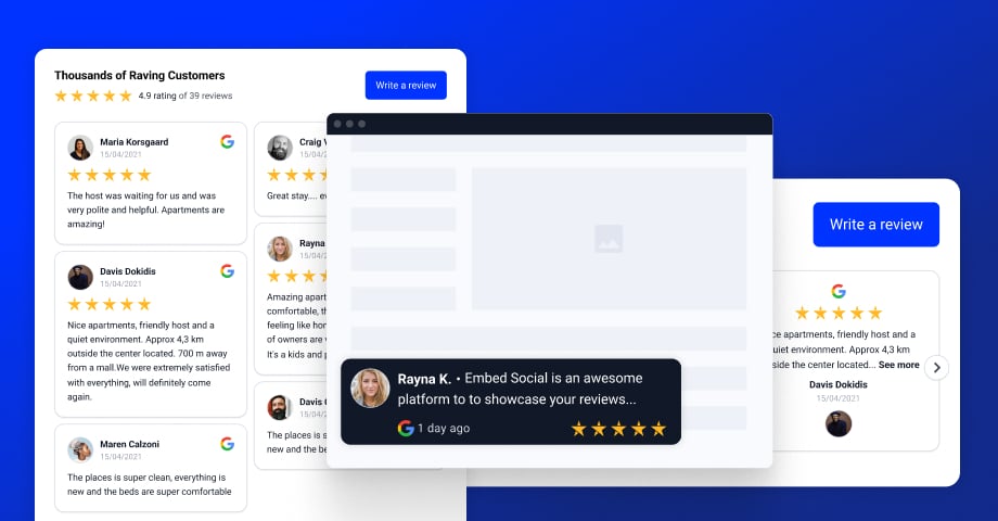
Showcase social proof on your website with a simple popover that shows as a fixed widget in the bottom left or bottom right on your website.
This widget appears on a page load and can be set to open all reviews on a click. Check the demo link to try it live.
New reviews widgets applicability
Our aim remains building products that customers would LOVE to put on their websites and give THEIR customers an innovative engaging experience.
Here are a few examples of how to uplift your website with reviews widgets:
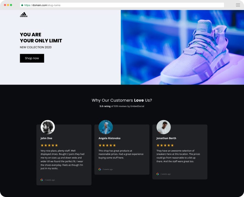
Reviews slider or carousel for homepages
Embed your slider or carousel right on your homepage. The social proof usually comes right below your hero image or call to action on your homepage.
Similarly, you can make the same structure of any landing page you use in your website conversion funnel.
Testimonials widget for eCommerce product pages
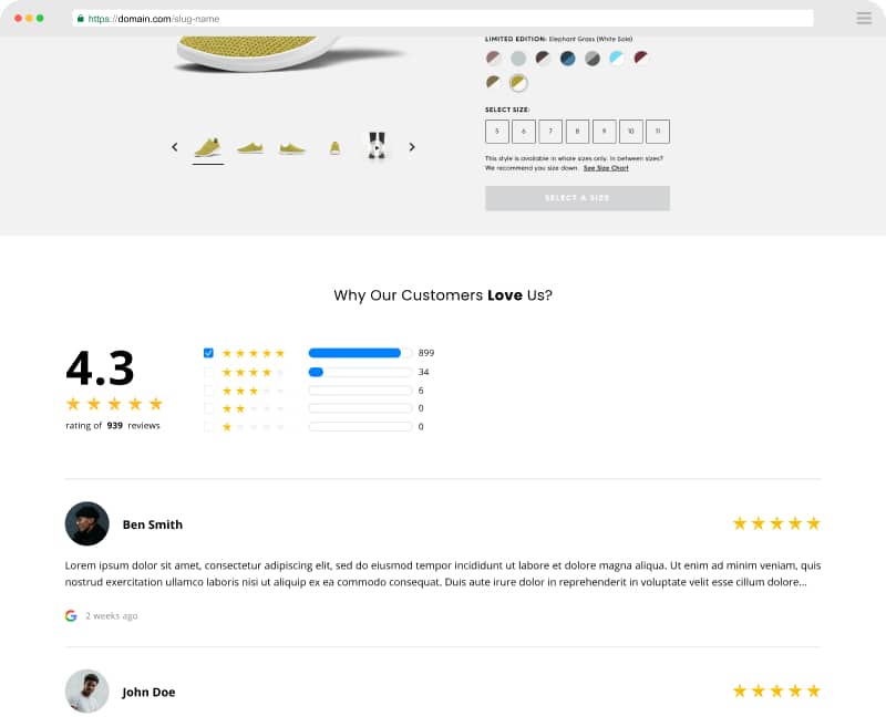
The Table and Page widgets are perfect for product pages. The best with these widgets is the option to get a review for that product right on that page, which will enable you to combine reviews in the widget captured from your social media account but also from visitors who left a review on the product page.
How to get started using the new reviews widgets?
As you can see from the pictures up above, our new layouts are ready-to-go!
You can use the new widgets, right now, by simply navigating to the Reviews Feed section and click on the feed you want to edit.
The last step is to simply change the option Layouts and select Grid, Column, Page, Table, Slider, Carousel.
And if by any chance you’re still not an EmbedReviews platform user, feel free to sign up for a free trial and check out the new reviews widgets.
If you need any additional help, our dedicated Customer Success team is always at your disposal (we can do that instead of you). Feel free to contact us for any questions.
However, as our design changes, our main mission remains – to go above and beyond to help our customers our users build trust with their clients and as a result – increase conversions.
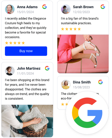
Embed Google Reviews Widget like a PRO
Automatically collect and embed Google reviews and use AI reviews management tools to unlock your website’s sales potential.
FYI: You can automatically embed Google reviews widget on your website and show authentic user-generated reviews, increasing trust for more sales. Try it now.

