


Official API integrations
EmbedSocial has official API integrations with all major social media networks.
Vibe code reviews, social posts, and UGC into embeddable sections for any website.


Loved by 400,000+ big and small brands. World-famous and local
We connect to all popular social media platforms so you can create any hero, CTA, pricing, social proof, testimonials sections or landing pages for any existing website.
Show Instagram feed.
Display YouTube.
Embed X widgets.
Embed LinkedIn.
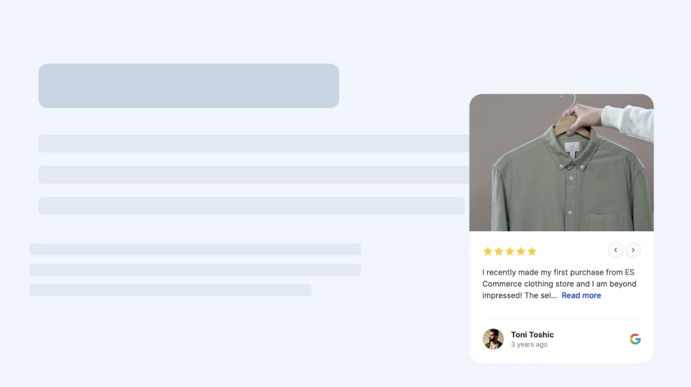
Embed Google reviews.
Embed playlist
Embed Threads.
Embed Trustpilot reviews.
Shop my feed
Social proof display
Embed hero
Link in bio page
Embed popup
Embed Reels.
Embed stories
Embed hashtag feed
Embed Facebook.
Show TikTok videos.
Embed YouTube hashtag
Embed Pinterest
Embed Vimeo
Embed FB reviews.
Embed Yelp reviews.
Display customer reviews.
Show review badges on your site.
Showcase customer love.
Embed testimonials
Embed Social wall
Embed Shorts
Embed carousel
Templates
Build social proof widgets, hero sections, CTAs, testimonials or other content blocks, and customize with AI to fit your site.
 Floating Reviews Popover
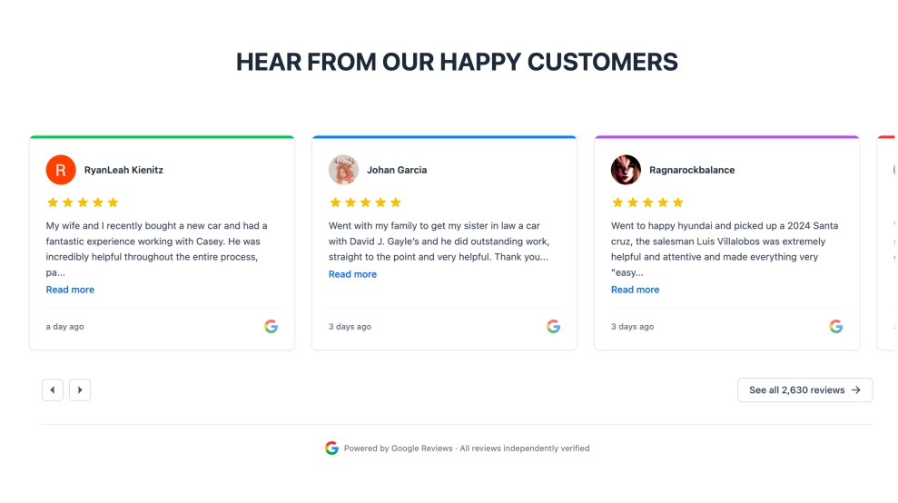 SaaS Google Reviews Slider
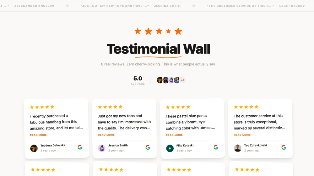 Testimonial Wall
 Social Wall CTA
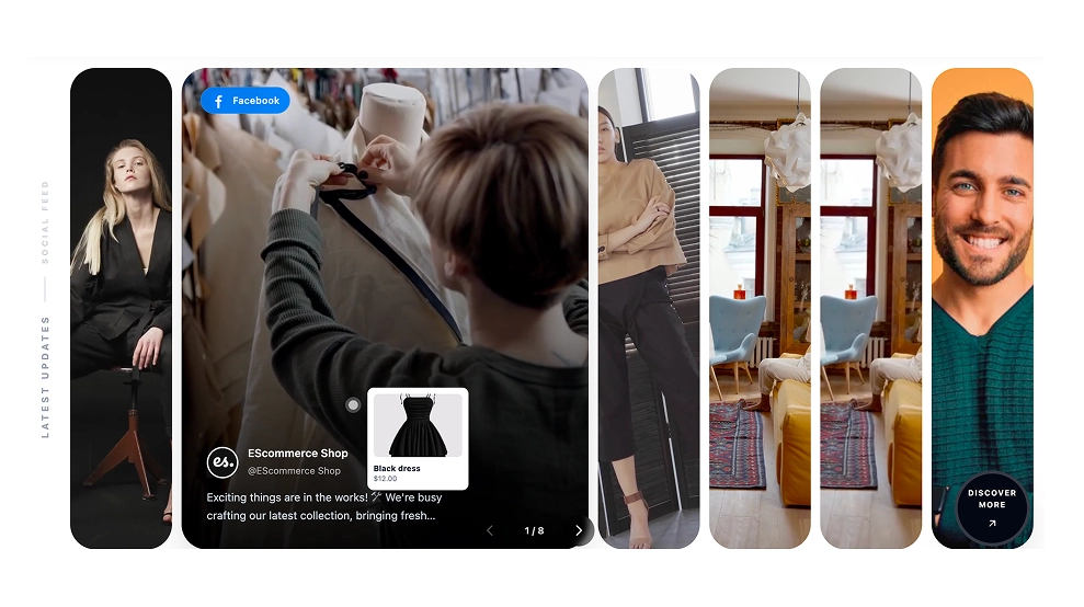 Facebook Slideshow
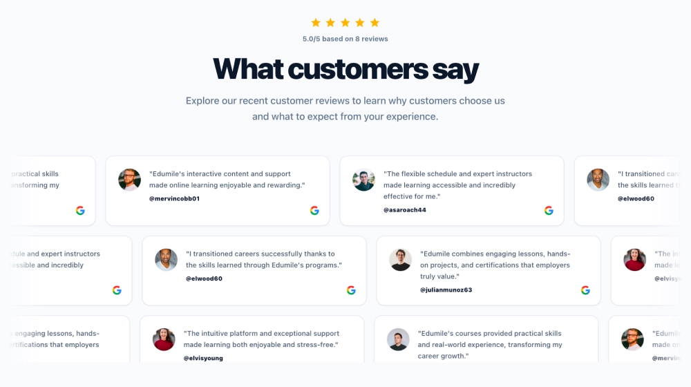 Google Reviews Ticker
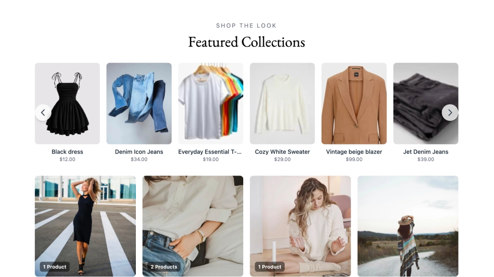 Instagram Product Catalogue
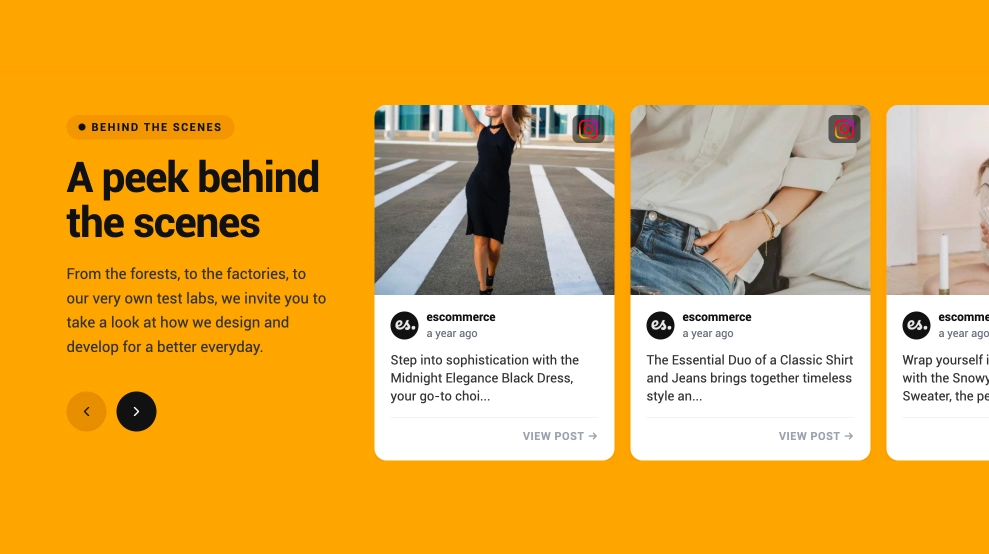 Behind The Scenes Widget
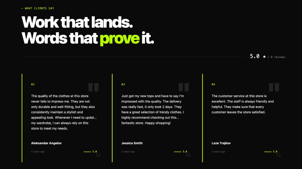 Agency Google Reviews Widget
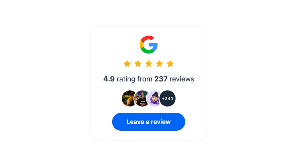 Collect Google Reviews Badge
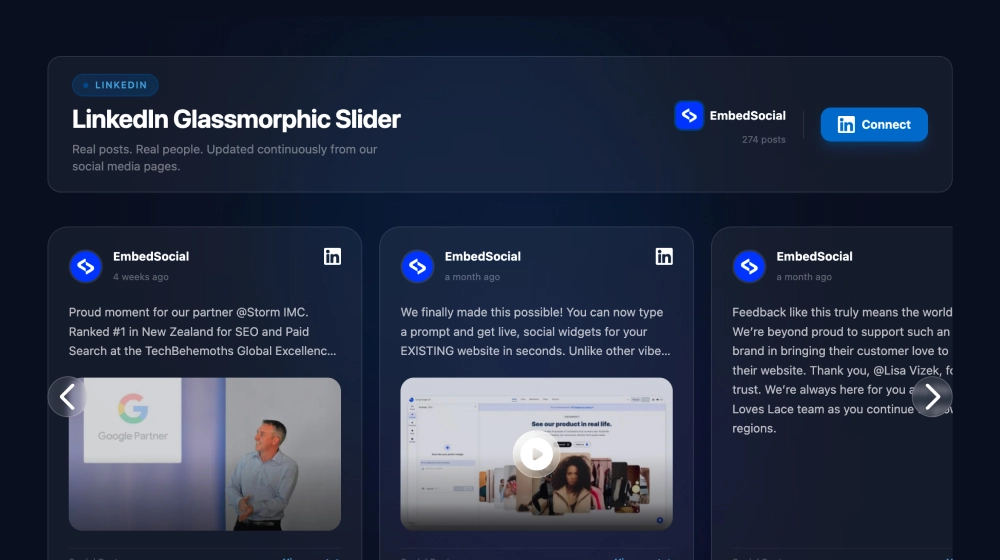 LinkedIn Glassmorphic Slider
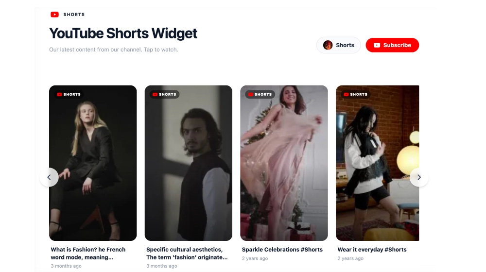 YouTube Shorts Widget
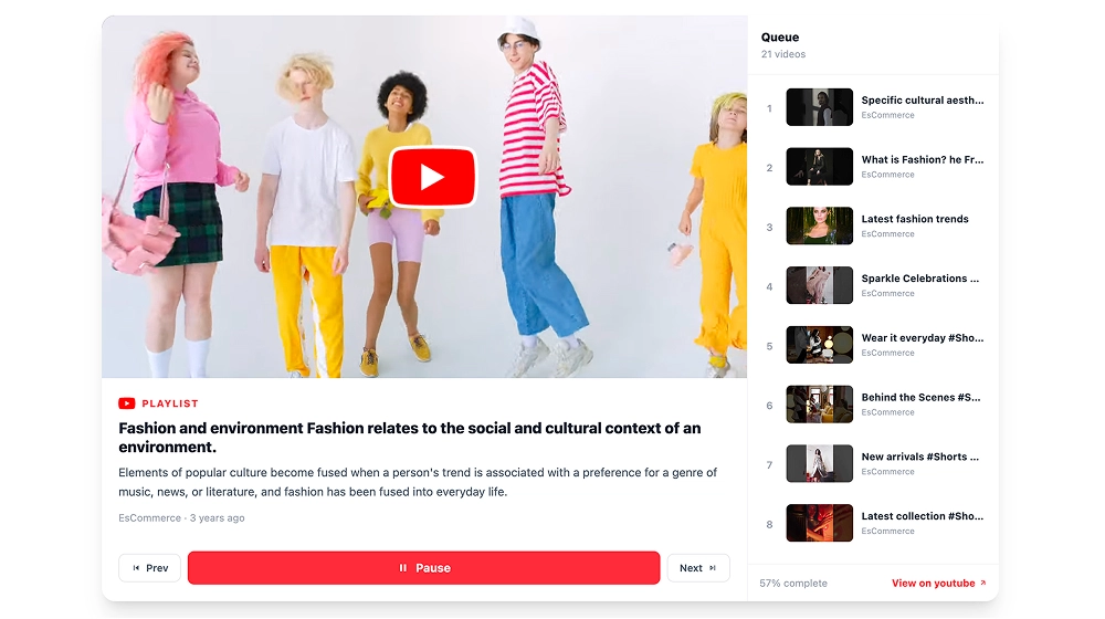 Video Playlist Widget
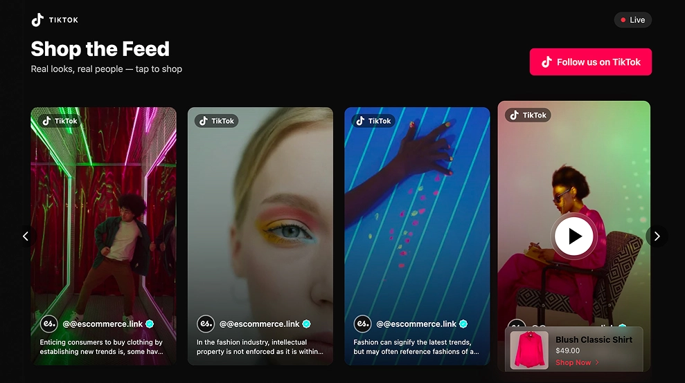 Shoppable TikTok Mentions widget
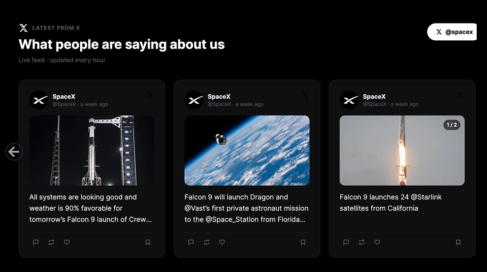 Modern X (Twitter) Slider Widget
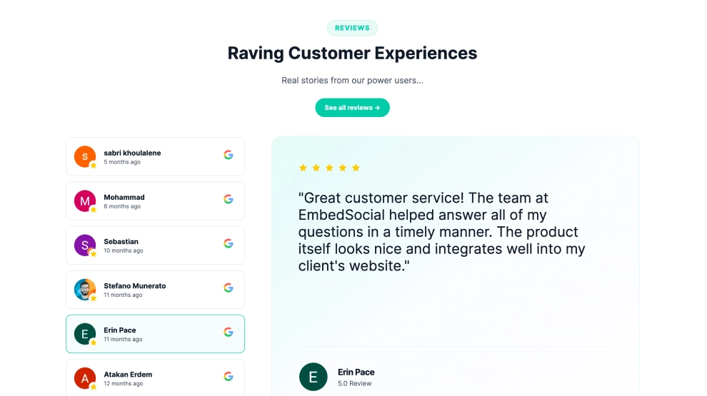 Google Reviews Tabs
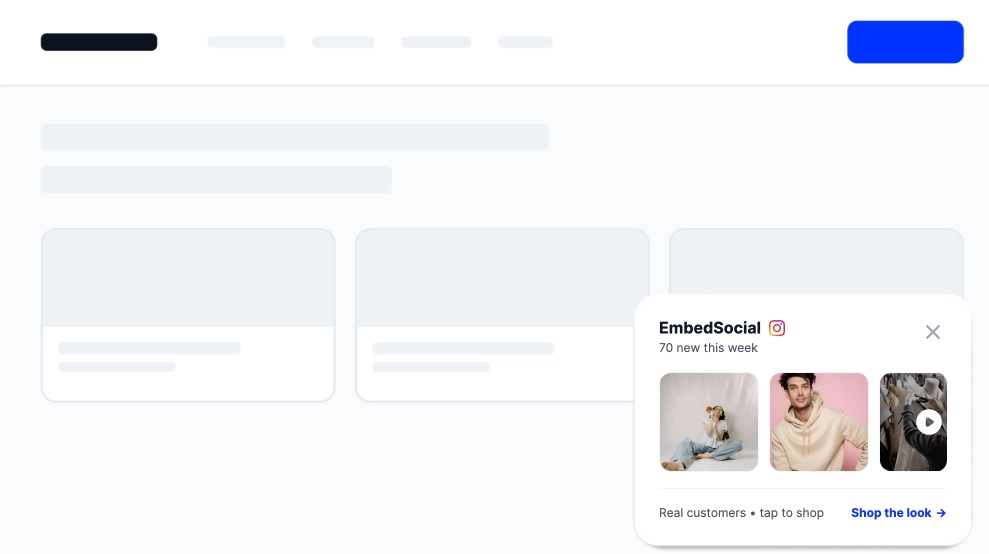 Floating Instagram Widget
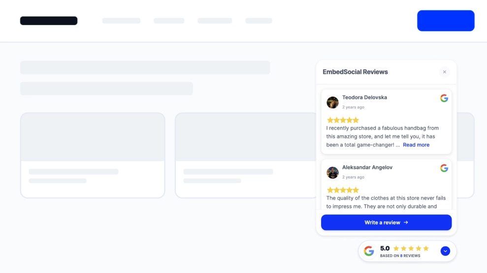 Google Reviews Floating Badge
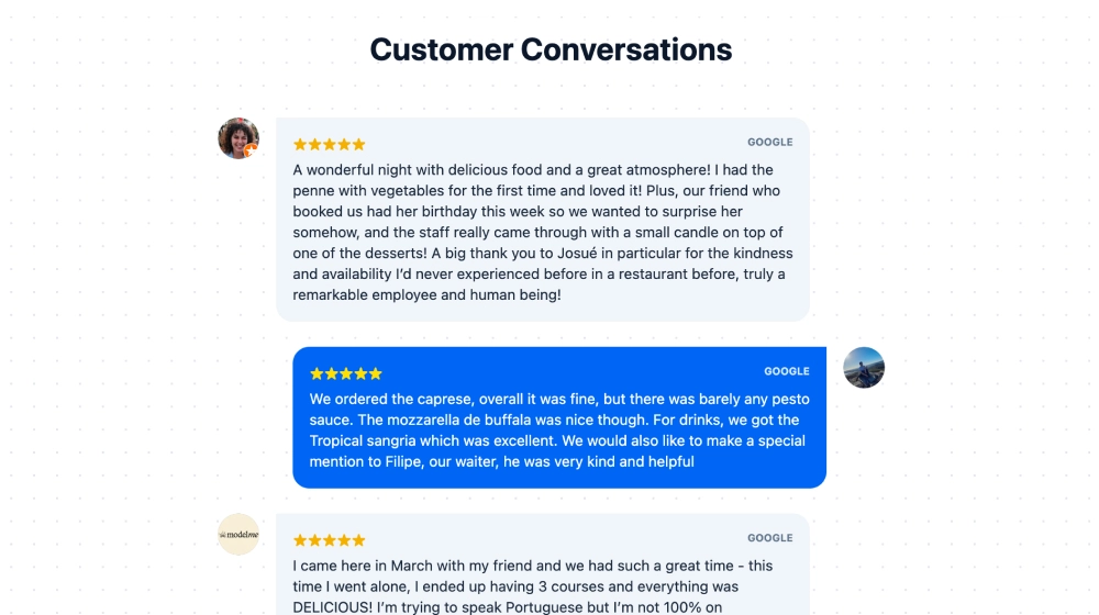 Google Reviews Thread
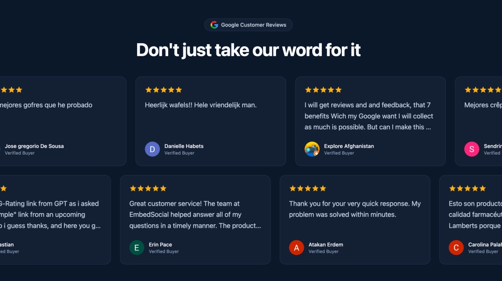 Google Reviews Marquee Slider
 Google Reviews Photo Hero
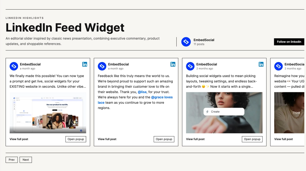 Classic LinkedIn Slider
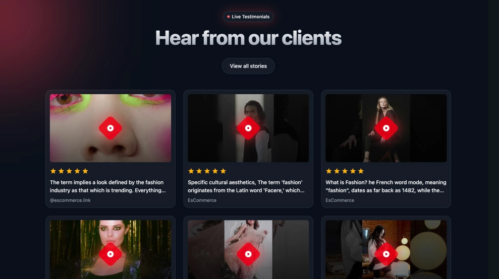 Modern Video Testimonial Widget
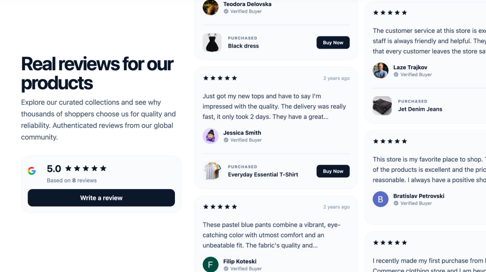 Shoppable Google Reviews Widget
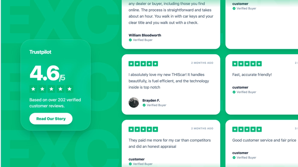 Truspilot Section
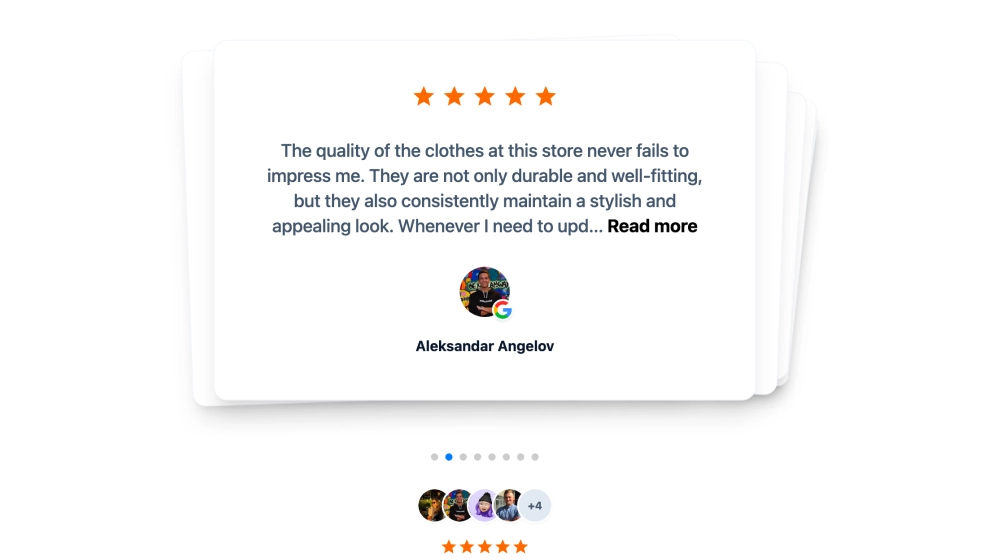 Customer Testimonials Widget
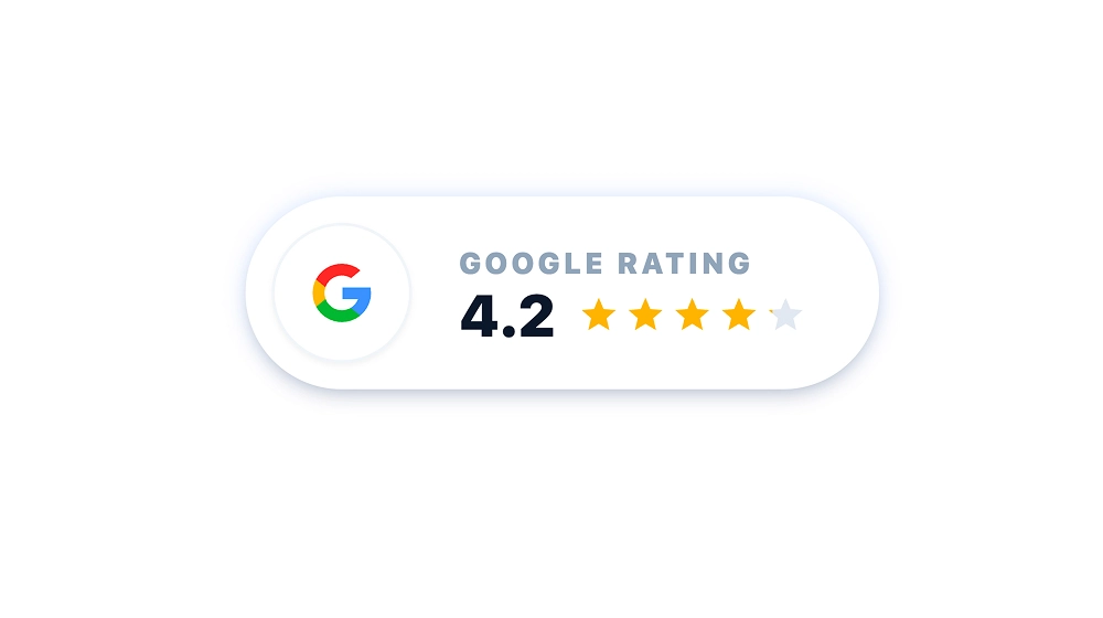 Small Google Reviews Badge
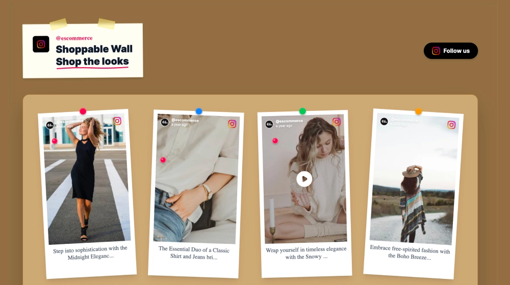 Shoppable TikTok and Instagram Wall
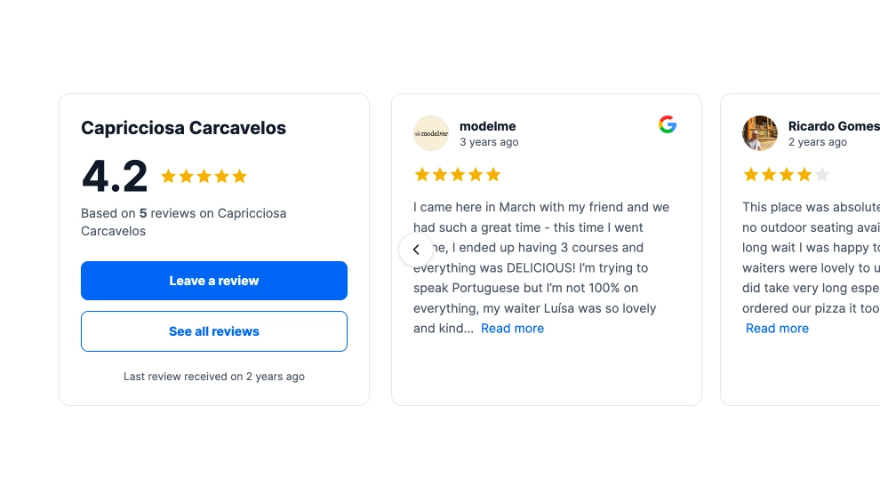 Modern Google Reviews Carousel
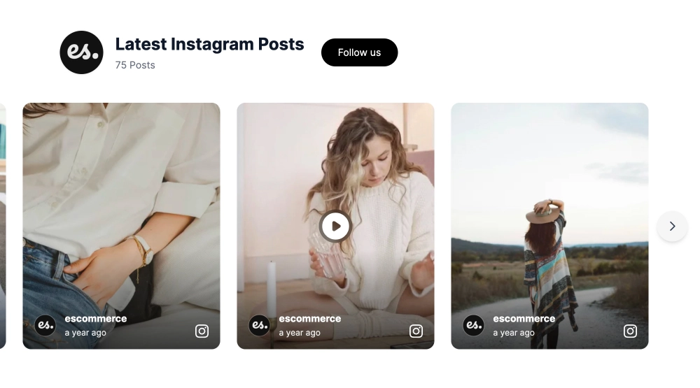 Instagram Gallery Slider
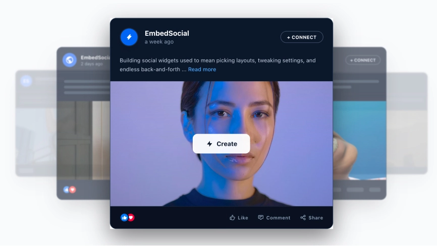 Modern LinkedIn Slider
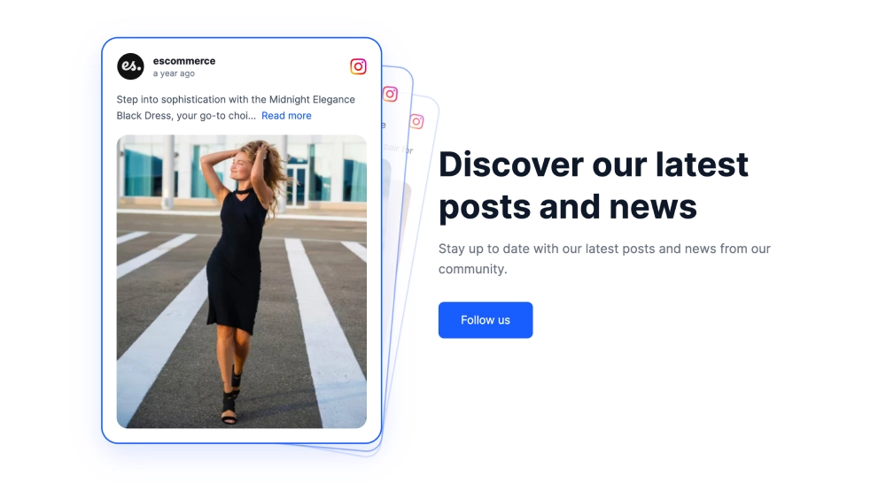 Social Media CTA Section
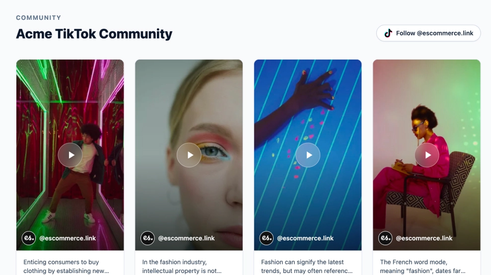 Classic TikTok Feed Widget
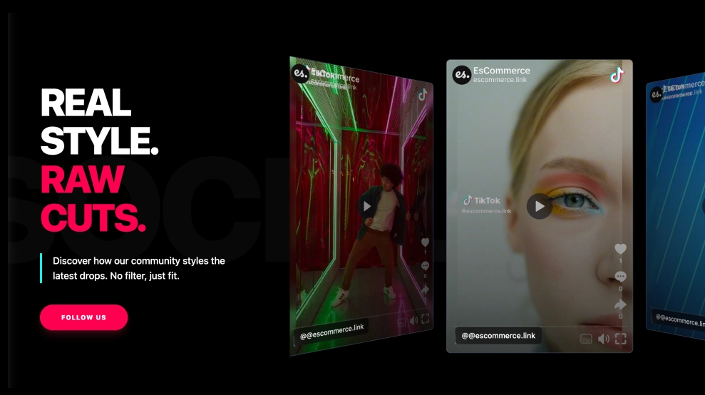 TikTok Hero Widget
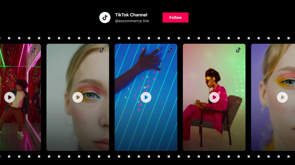 TikTok Film Strip Slider
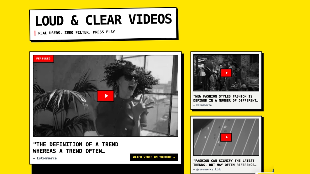 Futuristic Video Gallery
 Social Circle Carousel
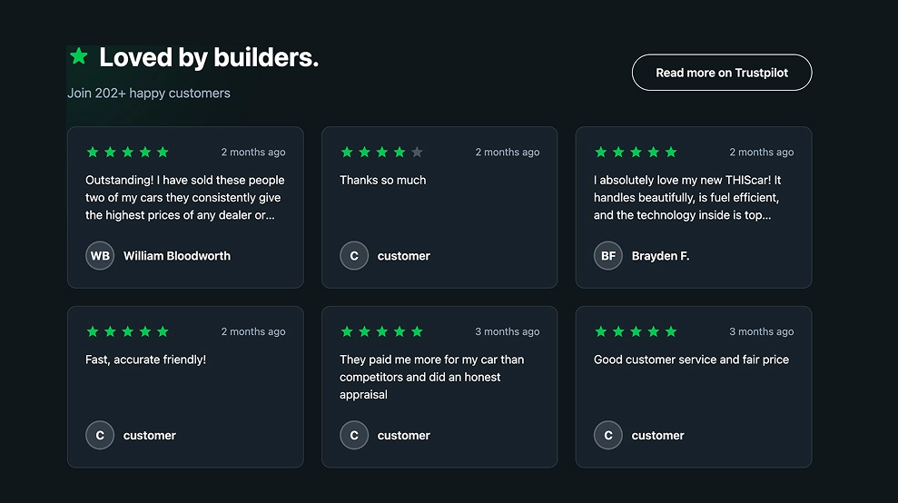 Dark Trustpliot Grid
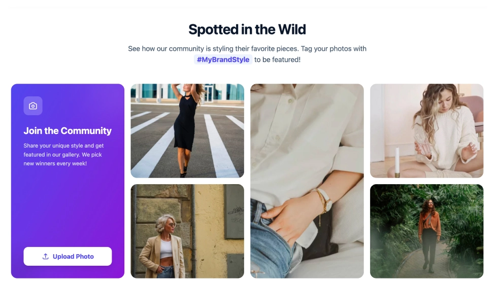 Classic Instagram Collage
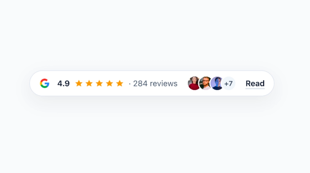 Trust Badge Compact
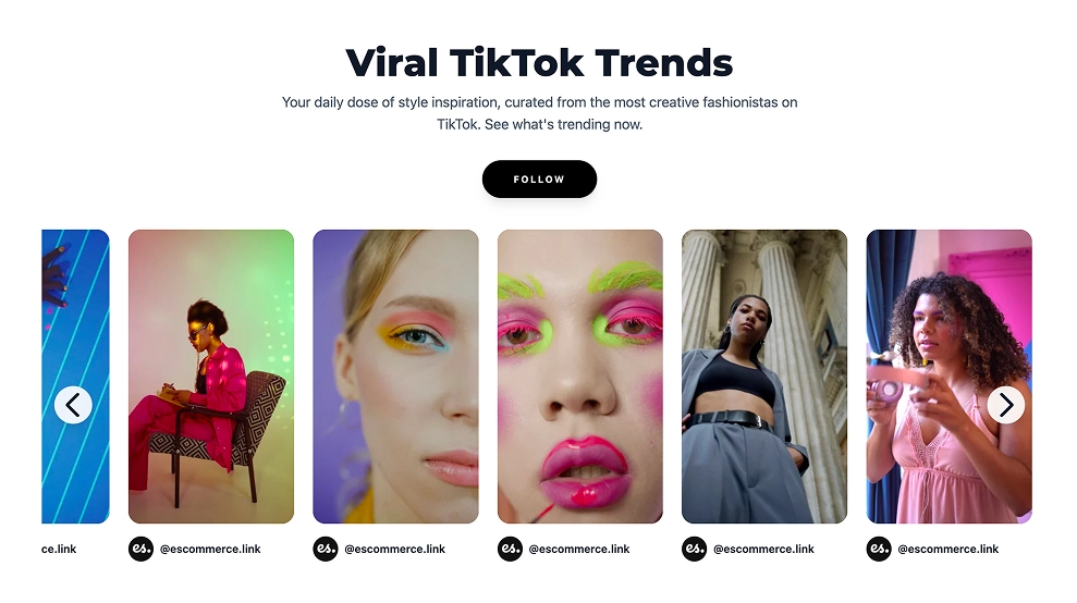 TikTok Slider Widget
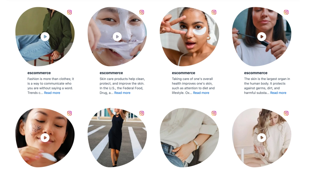 Instagram Bubble GridModern X (Twitter) Slider WidgetGoogle Reviews TabsFloating Instagram WidgetGoogle Reviews Floating BadgeGoogle Reviews ThreadGoogle Reviews Marquee SliderGoogle Reviews Photo HeroClassic LinkedIn SliderModern Video Testimonial WidgetShoppable Google Reviews WidgetTruspilot SectionCustomer Testimonials WidgetSmall Google Reviews BadgeShoppable TikTok and Instagram WallModern Google Reviews CarouselInstagram Gallery SliderModern LinkedIn SliderSocial Media CTA SectionClassic TikTok Feed WidgetTikTok Hero WidgetTikTok Film Strip SliderFuturistic Video GallerySocial Circle CarouselDark Trustpliot GridClassic Instagram CollageTrust Badge CompactTikTok Slider WidgetInstagram Bubble GridFloating Reviews PopoverSaaS Google Reviews SliderTestimonial WallSocial Wall CTAFacebook SlideshowGoogle Reviews TickerInstagram Product CatalogueBehind The Scenes WidgetAgency Google Reviews WidgetCollect Google Reviews BadgeLinkedIn Glassmorphic SliderYouTube Shorts WidgetVideo Playlist WidgetShoppable TikTok Mentions widgetModern Google Reviews CarouselInstagram Gallery SliderModern LinkedIn SliderSocial Media CTA SectionClassic TikTok Feed WidgetTikTok Hero WidgetTikTok Film Strip SliderFuturistic Video GallerySocial Circle CarouselDark Trustpliot GridClassic Instagram CollageTrust Badge CompactTikTok Slider WidgetInstagram Bubble GridFloating Reviews PopoverSaaS Google Reviews SliderTestimonial WallSocial Wall CTAFacebook SlideshowGoogle Reviews TickerInstagram Product CatalogueBehind The Scenes WidgetAgency Google Reviews WidgetCollect Google Reviews BadgeLinkedIn Glassmorphic SliderYouTube Shorts WidgetVideo Playlist WidgetShoppable TikTok Mentions widgetModern X (Twitter) Slider WidgetGoogle Reviews TabsFloating Instagram WidgetGoogle Reviews Floating BadgeGoogle Reviews ThreadGoogle Reviews Marquee SliderGoogle Reviews Photo HeroClassic LinkedIn SliderModern Video Testimonial WidgetShoppable Google Reviews WidgetTruspilot SectionCustomer Testimonials WidgetSmall Google Reviews BadgeShoppable TikTok and Instagram Wall
In just 3 simple steps you can have your social content synced on your website.
Link your Instagram, Google, TikTok, or upload CSVs.
Prompt the AI to build your widget design.
Copy one line of code and paste it on any website.
Transform static widgets into animated, swipeable experiences, instantly.
Manually added static text reviews


$29
Live animated UGC widget with product tags
Perfect for product displays, UGC widgets, and more.
This is UGC on a website that lives and breathes.
EmbedSocial syncs real customer content onto your website so it converts better, straight from your UGC platform instead of fabricated sources.
Tag products, apply themes, and generate layouts effortlessly.

Powerful social listening and publishing tools built right in.
Track keywords, hashtags, and competitor mentions in real time so you can jump on customer conversations before they cool off and spot emerging trends.
Explore social listening→
Plan a full content calendar, tailor each post per network, and hit publish on Instagram, TikTok, LinkedIn, and the rest in one shot.
Explore social publishing→
Never miss a customer. DMs, replies, @mentions, and review comments land in one shared queue your team can assign, answer, and resolve.
Explore social inbox→
Automate rights requests, tag content, sync products, and manage your team, all from one platform.
Activate a relevance score that tags each content piece for automatic moderation.
Define filters and make sure new content updates automatically.
Select which sources you want and handpick content for your widgets.
Automate content request rights via DMs or comments.
Sync products from Shopify, Google, Square or upload custom catalogs.
Learn how website visitors interact with the widgets.
Invite team members or your clients to collaborate.
Create multiple widgets from multiple social media platforms.
Enterprise-ready and ISO-certified for data security.
Get notified the moment a new brand mention is received.
Get better results with enhanced prompts when editing your widgets.
Repost posts from people who mention your brand.
Embed your widgets seamlessly on any CMS, site builder, or eCommerce platform.
Transform reviews and social media content into a live social proof.
29.00
month
Sync real customer content and publish on-brand widgets in minutes. 100% money-back guarantee.
EmbedSocial has official API integrations with all major social media networks.
We design interactive social media widgets that load fast on your website.
If it’s not for you, get a full refund. No questions asked.
Just click the bottom left chat icon, and our team will assist you in real-time.
TrovaTrip increased booking conversion rates by 12% with customer testimonials in just 4 weeks
Nick Poggi
TrovaTrip
The team at Embed Social is so easy to work with. They are very quick to respond to any special requests and fast to implement account changes. Aside from the great customer service, their products are also very easy to use and offer a lot of freedom that you can’t get with other similar products. Definitely recommend.
Ryan Hazlewood
Developer
EmbedSocial allows us to showcase social media content on our web pages in a way that’s both functional and vibrant. Their library of social feed designs integrates seamlessly with our existing components and is easy to use for page editors of all skill levels.
Zanna Ollove
Boston College
The experience with EmbedSocial has been amazing. We’re always looking for ways to leverage our time, so finding a product to keep our reviews fresh automatically was a no-brainer.
Brooks Hitzfield
Seven Sons
Everything you need to know about the EmbedSocial widgets.
You can create a wide variety of website UGC widgets, including social media feeds (Instagram, TikTok, YouTube, etc.), reviews, testimonials, sliders, stories/reels carousels, social wall widgets, video galleries, and more.
Yes. You can manage and moderate user-generated content with AI filters, manual approvals, keyword rules, and automated cleanup across every widget, including your Instagram widget, social wall, LinkedIn page widget, and all your vibe coding widgets.
Absolutely. Our social media aggregator can manage multiple social media accounts and content types (profiles, hashtags, mentions, etc.) and display these posts in a single social media widget or separate feeds, depending on your setup. Check our pricing plans and choose one that suits the number of sources you need.
You can pull and showcase content from Instagram, TikTok, Facebook, YouTube, Threads, LinkedIn, Google, X, Pinterest, and more, ideal for building cross-platform UGC widgets, social walls, or branded AI widgets.
EmbedSocial offers around 130 different ready-to-go social media UGC widget templates, including grid feeds, carousels, reels/stories widgets, hashtag feeds, and product-tagged shoppable layouts: all customizable and auto-synced for effortless UGC on your website. Some of them are even customizable via text prompts.
Yes. Widgets sync new user-generated content in real time, so your UGC widgets always stay fresh without manual updates.
Yes. Every EmbedSocial widget supports full customization (layouts, colors, spacing, fonts, filters, and advanced CSS) so your UGC blends seamlessly into your brand. You can even try our AI UGC widgets, which you customize with text prompts.
The pricing plans for EmbedSocial's social aggregator tool start at $29/month and provide all PRO features available in the platform. Plus, the platform provides one of the best free user-generated content aggregators you can start using with a branding banner and upgrade at any time to remove branding.
EmbedSocial integrates and works with all major content management platforms and web builders, such as WordPress, Squarespace, PageCloud, Joomla, Wix, Weebly, Shopify, Magento, Open Cart, and all platforms that support embedding third-party iframes or JavaScript. There is also an Instagram feed plugin available, plus support for vibe coding platforms like Bolt and Lovable.
Yes, the UGC widget will stop syncing and showing on your website, but you can come back and reactivate your account any time.