A great hero section is your digital first impression, and as such, it captures attention, frames your entire value, and makes the visitors decide whether to stay or bounce.
But designing a hero section from scratch is slow, messy, and often stuck behind endless iterations. Layouts, spacing, visuals, CTAs—it all takes time you might not have.
That’s why AI website design tools are changing the game. With EmbedSocial’s AI widget generator, you can produce a polished hero image design in seconds.
That way, you skip the usual design bottlenecks, and you test variations instantly. To prove it, I generated nine completely different hero section examples.
Keep on reading as I also share my AI prompts.
What is a hero section?
A hero section is the top, above-the-fold block of a webpage—the place where your brand introduces itself before the visitor scrolls even a pixel.
As mentioned above, hero sections are great for making your first impression, and you can think of them as your handshake and your opening line.
Their purpose is simple but powerful: capture attention instantly, communicate what you offer, and direct the visitor toward one clear action. A strong hero section reduces friction, builds trust, and anchors the entire page around a single message.
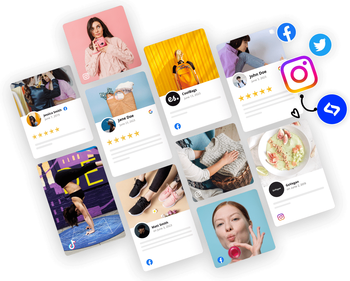
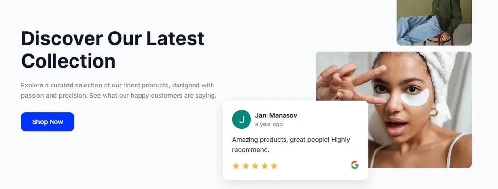
Most hero image designs should include a headline, a short supporting sentence, a call-to-action button, and a visual element such as an image, illustration, or video. Some brands also add light social proof like Google reviews and ratings, or customer social posts. When done right, that strengthens your credibility without overwhelming the layout.
Imagine a hero background video for a travel agency that continuously plays a video reel of the top destinations they offer tourists. Plus, it includes interactive elements that let you experience the landing page and the brand’s core message at your own pace.
Why your hero section matters for conversions?
Here are the full benefits of well-done website hero sections:
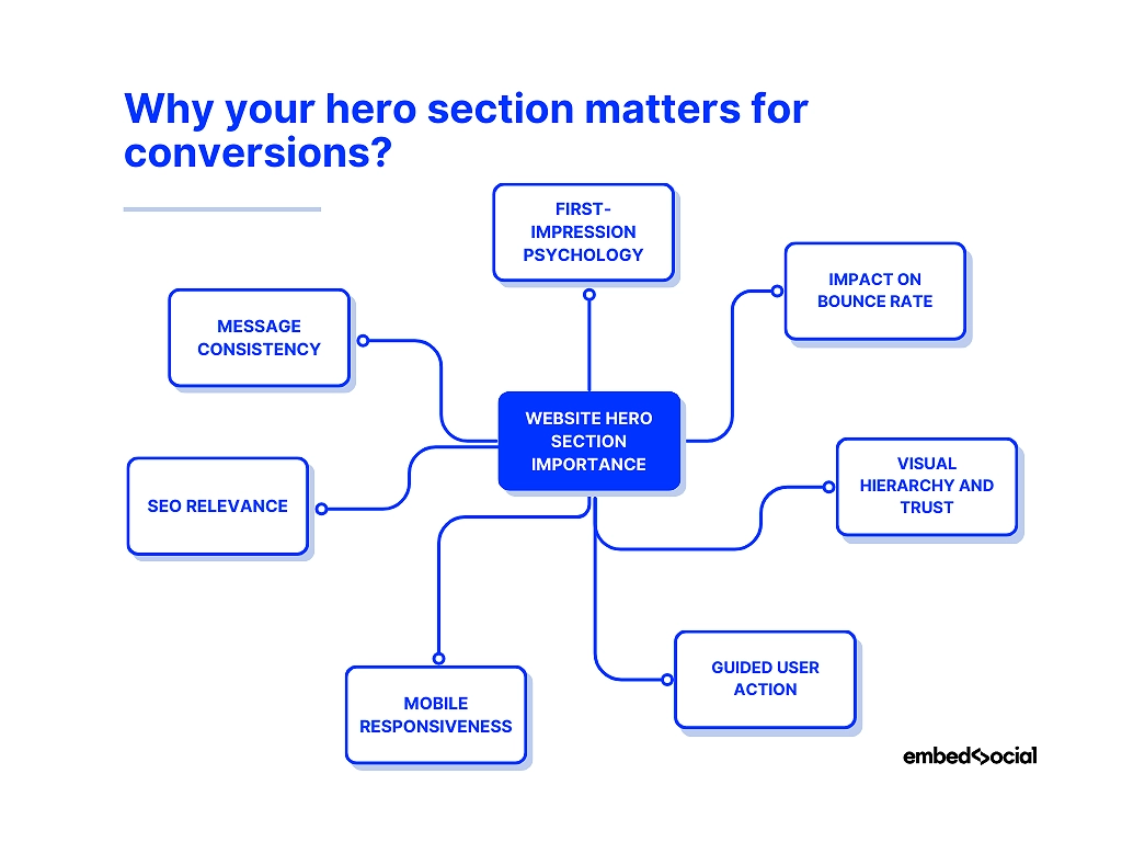
- First-impression psychology—people form opinions in milliseconds, so your hero must communicate value instantly;
- Impact on bounce rate—unclear or cluttered heroes push visitors away before they explore anything else;
- Visual hierarchy and trust—clean spacing, readable typography, and strong contrast make your brand feel credible;
- Guided user action—a focused CTA gives visitors a clear next step, removing hesitation from the customer decision-making journey;
- Mobile responsiveness—a well-optimized hero protects conversions on smaller screens where most traffic now lives;
- SEO relevance—high engagement signals like time-on-page, scroll depth, and lower bounce rate indirectly support your SEO rankings;
- Message consistency—a clear hero ensures every visitor receives the same strong value proposition from the start.
So, evidently, you (or an advanced AI UGC platform like ours) should create a visually prominent hero section for a website if you want to make a great first impression.
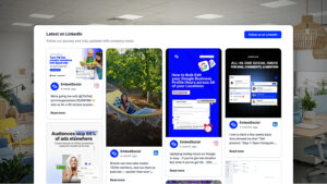
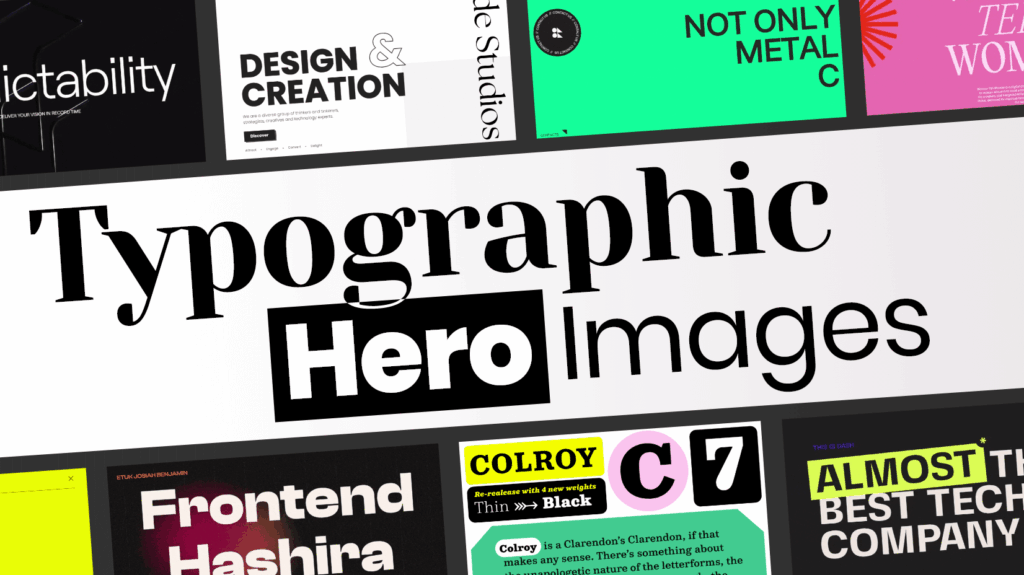
9 AI hero sections inspiration examples for your next design
It’s very easy to craft your next hero image design, and you don’t even need web designers to do it. You just need a simple text prompt describing what you want to see. With EmbedSocial’s AI widget generator, you can also use images showcasing your design.
That said, here’s how I generated 9 new hero sections via text-based prompts using our advanced AI tools for web design (with screenshots and prompts):
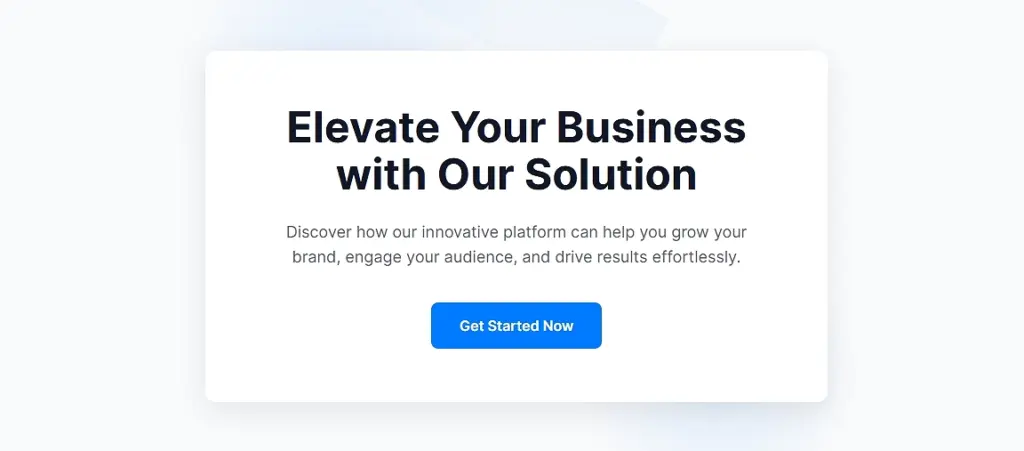
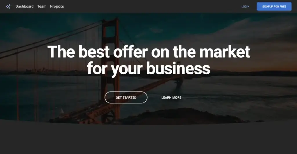
1. Minimalist SaaS hero section (no UGC)
“Create a clean, minimalist SaaS hero section with a bold headline, short supporting text, a single CTA button, and a subtle abstract illustration. White background, centered layout, modern typography.”
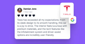
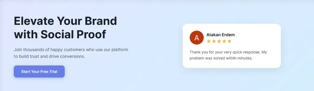
2. Testimonial-powered SaaS hero section (light UGC)
“Generate a split-layout SaaS hero section with a headline and CTA on the left and a testimonial card on the right, including a customer photo, 5-star rating, and a short quote. Use soft gradients and rounded shapes.”
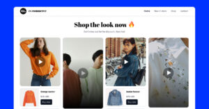
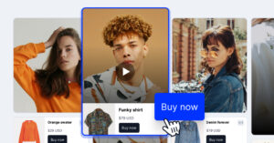
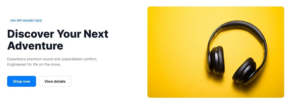
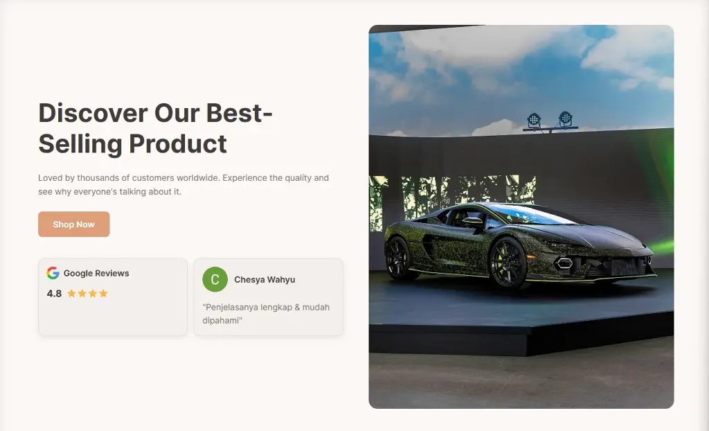
3. E-commerce product hero section (no UGC)
“Design a product-focused eCommerce hero section with a large lifestyle product image, a bold headline, a small discount badge, and two CTAs (‘Shop now’ and ‘View details’). Clean, modern layout.”
4. E-commerce hero section with review badges (light UGC)
“Create a hero section with a product photo on the right and a headline, CTA, and two review badges on the left—one Google star-rating badge and one short testimonial snippet. Warm, friendly color palette.”
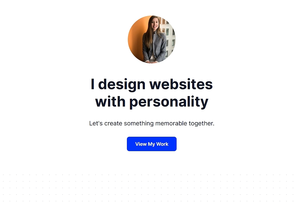
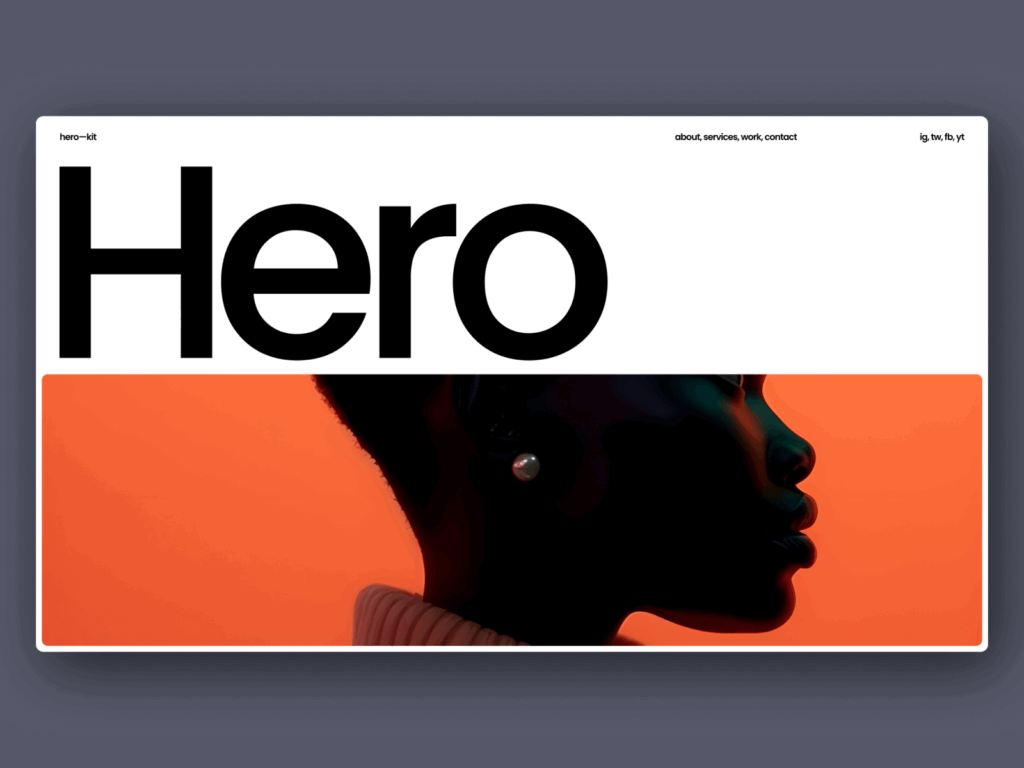
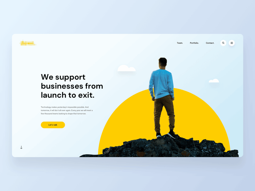
5. Portfolio or creator hero section (no UGC)
“Generate a portfolio-style hero section featuring a large portrait image, a simple headline (‘I design websites with personality’), a short subtext line, and one CTA. Sleek, visual-first, centered alignment.”
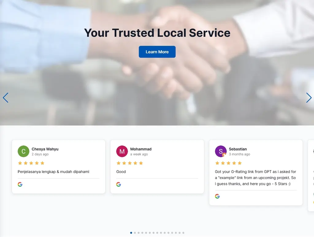
6. Service business hero section with rotating reviews (UGC-heavy)
“Design a hero section for a local service business with a large background image, a clear headline, one CTA, and a rotating carousel of customer reviews underneath. Professional, approachable style.”
7. Agency hero section with logo bar (light UGC)
“Create a hero section for a digital agency with a headline, subheading, CTA, and a row of client logos below (‘Trusted by 300+ brands’). Vibrant color accents and geometric shapes.”
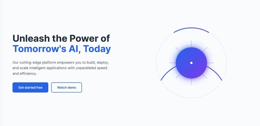
8. AI Startup hero section (no UGC)
“Generate a hero section for an AI startup with a custom tech illustration, strong headline, supporting paragraph, and two CTAs (‘Get started free’ and ‘Watch demo’). Futuristic, clean design.”
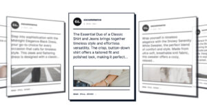
9. Retail or hospitality hero section with customer photos (light UGC)
“Design a hero section featuring a photo collage of our products, a bold headline, a short description, and one CTA button. Add one testimonial card overlay for credibility.”
Hopefully, my best hero sections (which I created in minutes) have inspired you to create your own and forget about the manual process of doing it from scratch.
The best part: when you infuse them with user-generated content (like above), they will also stay fresh since you’ll regularly get new content from reviews and social media.
How to design hero section pages using AI via EmbedSocial?
Now, let me show you how to create your own website hero section with AI that will fit just right on any of your landing pages. Just follow a few simple steps:
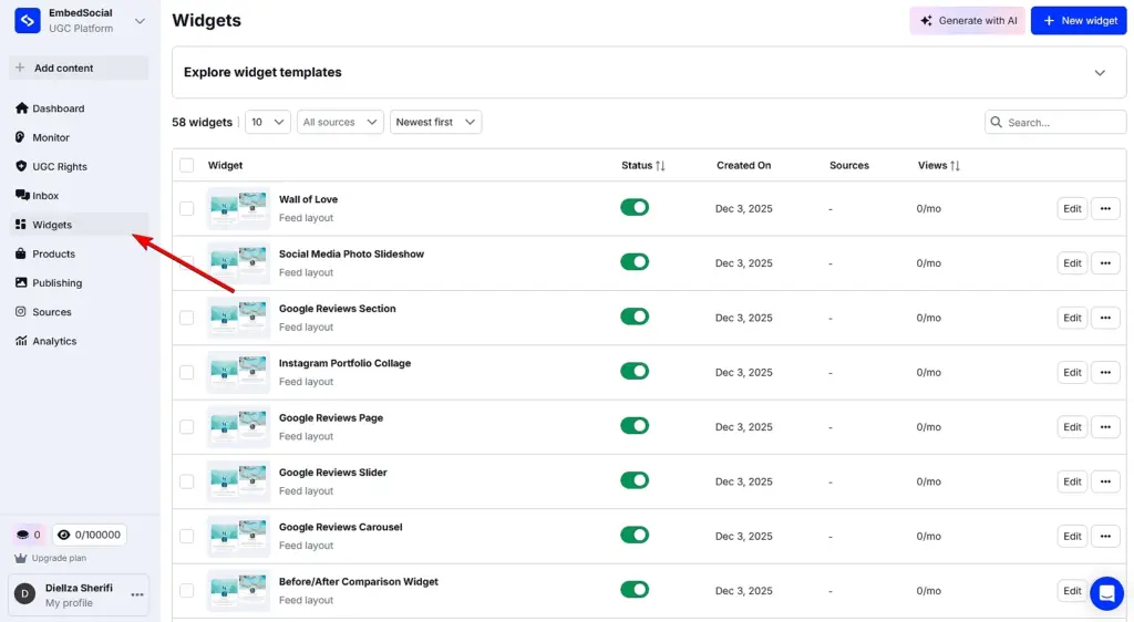
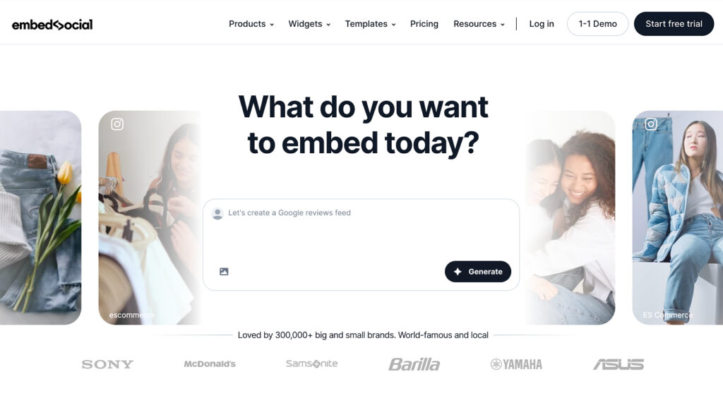
Step 1: Log in and access the ‘Widgets’ section
First things first, you have to create your EmbedSocial account, or start a 7-day free trial, and just log in. Then, navigate to the ‘Widgets’ section from the left menu:
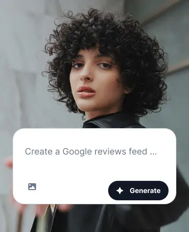
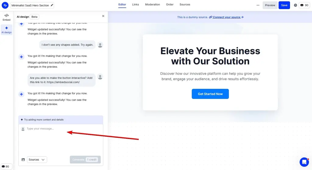
Step 2: Start describing your perfect hero section
After pressing ‘Generate with AI’ (top-right corner), you’ll be taken to our widget generator, where you can add your text prompt and/or image to provide the right context.
After uploading your image and/or providing textual content, press ‘Generate’. Note that you will need 1 credit for each prompt you use:
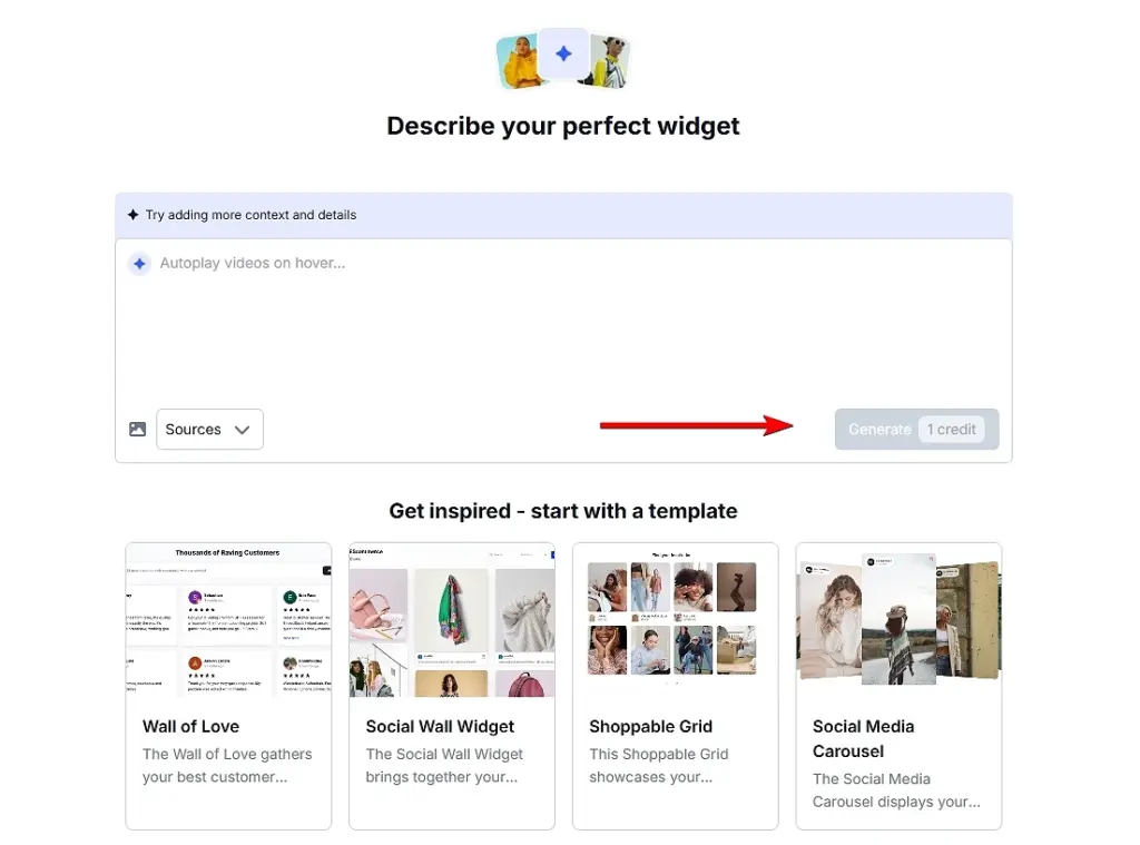
Pro tip: If you are unsure where to start, you can always pick one of our many templates and further customize it as you see fit. You can find them below the prompt field.
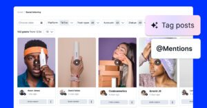
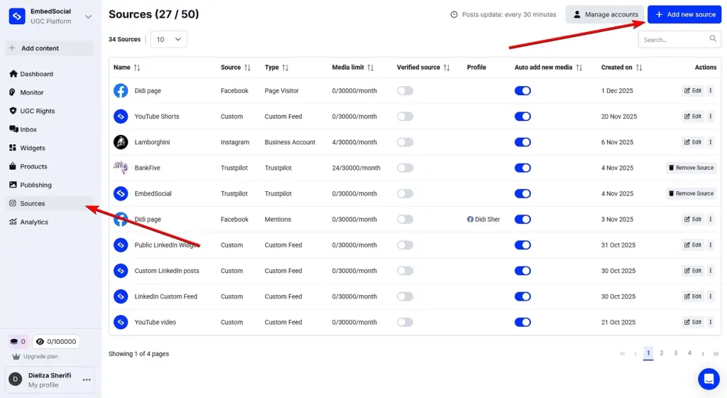
Optional step: Connect your UGC source(s)
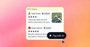
If you are planning to use any UGC in your hero section (most of our users do since it offers great social proof value), you will have to connect it first under the ‘Sources’ tab.
Once there, tap ‘Add new source’ and follow the on-screen prompts for any of the platforms. And when describing your widget, you can choose it from the dropdown menu:
Step 3: Customize your hero section widget (if necessary)
You have the freedom to keep prompting our AI widget editor to get the right look for your hero section. So, if there’s something that feels off, tell the editor to change it:
Pro tip: You can also change the UGC source at this point (or add more than one source). Just tap ‘Sources’ on the top bar and pick the content you want to add.
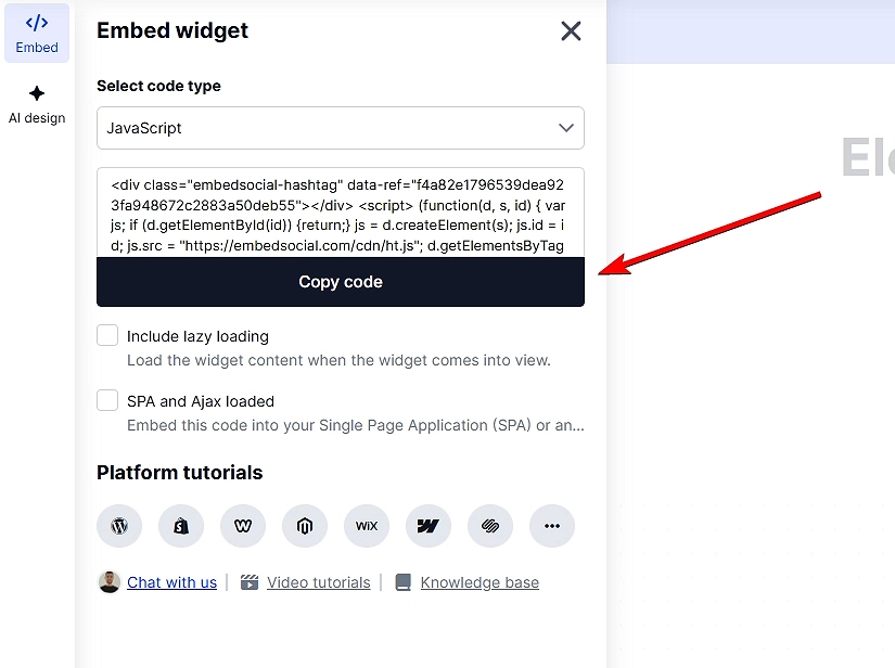
Step 4: Add your hero section to your webpage
When you’re done customizing your new hero section, just go to the ‘Embed’ tab (top-left corner). There, tap ‘Copy code’ and navigate to the webpage where you want to add your hero section. Finally, just paste the code in an empty HTML element and save your page.
Pro tip: Be on the lookout for common issues like:
- weak or vague headlines that fail to communicate value,
- overloaded visuals that distract from the message,
- too many CTAs competing for attention.
- poor mobile responsiveness,
- misaligned branding,
- messy typography.
7 best practices for crafting the right hero section
You know you have a strong hero section if it blends clarity, structure, and visual psychology. All of these principles shape every high-performing hero section. To achieve that result, you can follow a few best practices, such as these:
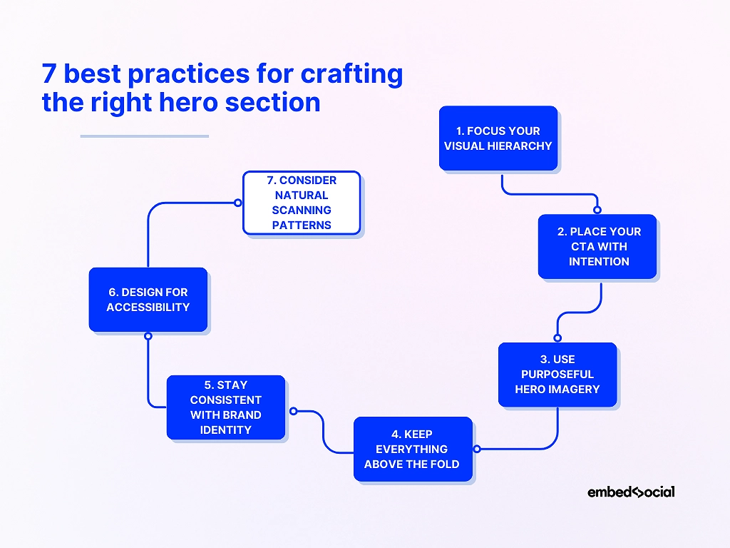
1. Focus your visual hierarchy
Your headline should lead, your subtext should clarify, and your CTA should stand out without overwhelming the design. Good hierarchy reduces cognitive load and helps visitors instantly understand your offer.
2. Place your CTA with intention
Your main CTA should sit close to the headline and remain visible without scrolling. Clear placement gives visitors a natural next step and prevents decision fatigue. The first glance of your website visitors should always fall on your main CTA.
3. Use purposeful hero imagery
Pick visuals that reinforce your message rather than compete with it. Whether you use product shots, illustrations, or simple backgrounds, the image should support—not distract from—the main CTA.
4. Keep everything above the fold
Your headline, supporting copy, and CTA should all appear without scrolling. Staying within a 600–800px height keeps your hero section sharp, scannable, and focused on action.
5. Stay consistent with brand identity
Typography, colors, and tone should align with the rest of your website. Consistency builds trust and makes the hero section feel like part of a cohesive design system. That said, you should decide on bold colors that capture the user’s attention.
6. Design for accessibility
Use high-contrast colors, readable font sizes, descriptive alt text, and clean HTML structure. Accessibility improves engagement and helps ensure that every visitor can interact with your content. All other elements in your hero section design must grab attention, too.
7. Consider natural scanning patterns
People skim in predictable F-patterns and Z-patterns. Structuring your hero section around these behaviors makes it easier to read at a glance and increases the chance a visitor sees your CTA.
Pro tip: When you want a faster starting point without wrestling with layout rules, EmbedSocial’s AI widget generator automatically applies these best practices—so you begin with a strong structure rather than a blank canvas.
Hero section layout types and when to use each
Different hero section layouts serve different goals. Choosing the right one depends on your product, target audience, and the action you want visitors to take. Here are the most effective hero section types, each paired with a real-world scenario that shows when it works best.
Split-screen hero section
A split-screen hero section divides copy and visuals evenly, giving both equal weight. This layout is ideal when you need clarity and immediate context.
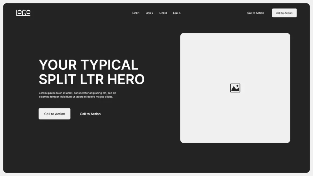
✨ Imagine a fitness app showing its dashboard on one side and a strong, action-driven headline on the other—visitors instantly understand what the product does.
Minimalist hero section
Minimalist hero sections use clean spacing, understated visuals, and a short headline. They work well for brands that want a premium, modern look.
✨ Picture a boutique skincare brand using a single line of copy and a soft product photo to signal elegance and simplicity.
Bold headline hero section
Here, typography carries the message with oversized, high-contrast text. This style shines when your offer is simple and powerful.
✨ Think of a startup launching a new AI tool with the headline “Automate Everything”—no distraction, just immediate impact.
Video hero section
Video-driven hero sections communicate emotion and context instantly, making them perfect for storytelling for brands like travel companies.
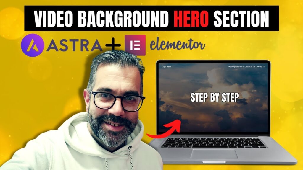
✨ A travel company might show sweeping drone footage of destinations to evoke desire before the visitor reads a single word.
Product-focused hero section
This layout puts the product front and center, often with a large image or 3D mockup. It’s ideal for physical or digital products that sell visually.
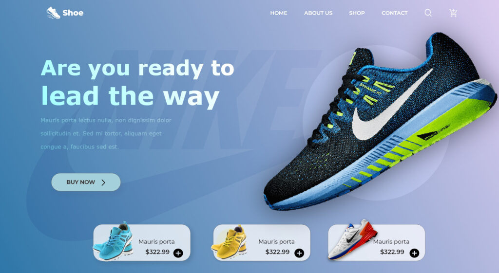
✨ A sporting shoe brand could showcase a close-up of its products that showcase the design, colors, materials, and more.
Background image hero section
A full-width background image creates atmosphere and mood without dominating the copy. Use it when you want emotion to frame your message.
✨ A coffee roastery might use a warm, textured café scene behind its headline to create instant vibe and familiarity.
Illustration hero section
Illustrated heroes feel playful, creative, and modern, and as such, they work great for SaaS, education, or creator-focused brands.
✨ An invoicing app might use custom illustrations of simplified workflows to make the product feel friendly and less intimidating.
Center-aligned hero section
This symmetrical layout centers everything—headline, subtext, CTA—making it clean, balanced, and easy to read for all sorts of brands.
✨ A nonprofit might use a centered hero to highlight a donation appeal with a clear CTA beneath it.
How EmbedSocial uses AI website design to transform your hero sections and other website blocks?
Building a hero section that actually converts is hard enough. So, building all the other supporting sections—testimonials, CTAs, FAQs, product highlights—is a full-time job.
Well, EmbedSocial does all that with a simple prompt and one button click. In a few seconds, you’ll get polished, modern website blocks that feel and look great on your pages.
Instead of dragging boxes around inside a page builder or spending hours tweaking spacing, EmbedSocial handles the aesthetics and functionality for you.
The best part is that nothing is locked in. You can always redesign the headline, switch visuals, adjust colors, change section height, or add social proof without touching a design tool. Every section stays editable, responsive, and consistent with the rest of your site.
With EmbedSocial, you can:
- Generate any section—hero sections, CTA banners, FAQs, testimonials, review strips, or product modules reshape themselves instantly;
- Stay on-brand at all times—choose specific fonts, spacing, colors, and imagery without wrestling with CSS code;
- Embed everywhere—copy one code snippet, and it works on WordPress, Webflow, Wix, Shopify, and any custom site.
You can generate multiple versions of the same hero section with different headlines or CTAs. Even tiny shifts in messaging can dramatically improve conversions, and creating variants takes seconds, as you only have to write a simple text prompt.
At the end of the day, with EmbedSocial, you stop wrestling with layouts and start producing the crisp, modern website sections visitors expect nowadays.
Pro tip: Use light social proof inside your hero section—like a Google star rating or a short testimonial—to boost trust without overwhelming the design. EmbedSocial makes this effortless because reviews live inside the same system that powers the layouts.
Conclusion: Build a high-converting hero section in minutes
The bottom line is that a great and effective hero section doesn’t happen by accident. You need to be clear on your messaging and create a strong visual hierarchy.
Think of layouts that guide visitors toward a single, meaningful action. When these essential elements work together, your website feels sharper and more trustworthy.
The good news: with EmbedSocial’s AI widget generator, you can create polished hero sections just like that. All it takes is a simple text prompt to get what you need! It’s faster, cleaner, and built for teams that want to ship better pages with less effort.
So, you now have the best practices, layout patterns, and AI-powered tools to create a hero section that stands out and performs from the get-go.
Start generating your next hero section in seconds with EmbedSocial!
FAQs about hero sections on websites
What is a hero section on a website?
A hero section is the top, above-the-fold area of a webpage that introduces your brand’s main message with a headline, short text, visuals, and a CTA. It sets the tone for the entire page and is often the section users judge first.
What is the difference between landing page and hero section?
A landing page is a full, standalone page built around a single action, while a hero section is just the opening panel at the top of that page. You can design both manually or generate them faster through AI tools like EmbedSocial.
How to create a good hero section?
A good hero section uses a clear headline, strong visual hierarchy, focused messaging, and one primary CTA. Many brands speed this up by generating the initial layout with AI—something our platform can handle in seconds.
What should a hero section look like?
It should feel bold, clean, and instantly understandable with a clear headline, supportive visual, and balanced spacing. Whether you design it manually or generate it with AI, the layout must guide the visitor toward the CTA immediately.
What should be in a hero section?
A headline, subtext, CTA, and a visual element are the essentials. Optional additions like testimonials, star ratings, or review widgets can add trust—and tools like EmbedSocial make it easy to drop these in without manual design work.
Can AI design my hero section?
Yes. AI can generate layouts, headlines, visuals, CTAs, and even light social proof instantly, giving you a polished starting point. With tools like EmbedSocial, you can customize the results and publish them directly to any website.
What is the best hero section size?
Most effective hero sections stay around 600–800px in height on desktop, so visitors see the core content without scrolling. Mobile spacing should be adjusted separately, especially when using dynamic or AI-generated designs.