Your website needs strong CTAs, as that’s where intent turns into action. Visitors stop scrolling and decide whether to sign up, buy, subscribe, or leave.

No pressure, right?
Don’t worry, as that’s an easy problem to solve. Most CTAs are either overdesigned, underwritten, or copied from competitors who copied them from someone else.
They look fine, say very little, and quietly leak clicks.
This is where you can flip the script using AI-designed CTAs. Instead of manually creating and rewriting CTA sections from scratch, you can now generate complete, conversion-ready CTA sections from simple text prompts—layout, copy, and structure included.
Below, I break down what a CTA section really is, what makes it effective, and show you 10 AI-generated CTA section examples created with an AI UGC website builder—so you can steal the patterns, reuse the prompts, and build faster without guessing.
What is a CTA section?
A call to action (CTA) is a clear instruction that tells visitors what to do next.
So, what is a call-to-action?
The call-to-action meaning is about guiding users toward a specific outcome you want to achieve, such as signing up, buying, downloading, or contacting you.
On the other hand, CTA sections are dedicated blocks that combine every element: persuasive copy, visual structure, and one primary action to drive conversions.
This is where many people get confused, so let’s be precise.
- A CTA button is just the clickable element—text like “Get started” or “Book a demo”.
- A CTA section includes the entire context around that button: the headline, supporting text, background, layout, spacing, and visual cues.
That’s why effective CTA sections outperform standalone buttons. They reduce hesitation, reinforce value, and give visitors a clear reason to act where the decision happens.
Why are CTA sections critical for website conversions?
CTA sections are the decision-making moments on your website. They invite action, remove doubt, and push visitors toward the next step.
Here’s why they matter so much:
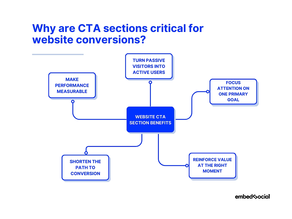
- They turn passive visitors into active users—a clear CTA section tells people exactly what to do next instead of leaving them to guess;
- They focus attention on one primary goal—by isolating the action, you eliminate distractions and increase the chance of conversion;
- They offer a clear value proposition at the right moment—strong headlines and supporting copy remind visitors why acting now is worth it;
- They shorten conversions—less scrolling, less thinking, fewer drop-offs;
- They make performance measurable and improvable—CTA sections give you a clear point to test, tweak, and optimize over time.
Think about it like this: Without well-placed CTA sections, even the best-designed pages bleed conversions. With them, every page has a clear purpose.
Read more:
10 AI CTA section examples generated via EmbedSocial
Below are 10 AI-generated CTA section examples I created in minutes using EmbedSocial. They are not abstract ideas or static CTA templates—they are real website CTA examples built from text prompts to show how modern CTA sections can be designed and deployed quickly.
Each example is meant to serve as CTA design inspiration, highlighting what makes effective CTA sections work in different scenarios. You’ll see how layout, copy, and placement come together in some of the best CTA examples for SaaS, e-commerce, and other sites.
Focus on the patterns, as the goal is to understand how to generate high-performing CTA sections consistently, using an AI generator instead of manual guesswork.
1. Hero CTA section for SaaS signup
CTA section type: Hero section (above the fold)
AI prompt used: “Create a high-converting hero CTA section for a SaaS product. Use a bold, outcome-focused headline, a short supporting line that removes friction, and a primary CTA button for SaaS signup. Keep the layout clean, high-contrast, and immediately scannable.”

Why this CTA section works: This CTA section works because it combines strong intent with immediate clarity. The headline focuses on the result users want, the supporting copy reduces hesitation, and the above-the-fold placement makes the next step impossible to miss.
2. Feature upgrade CTA section
CTA section type: Mid-page feature section
AI prompt used: “Create a CTA section encouraging users to upgrade to a premium plan. Highlight unlocked features, emphasize added value, and include a clear upgrade CTA. Keep the design clean and persuasive, without urgency.”
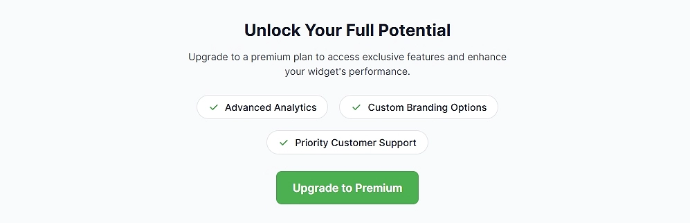
Why this CTA section works: This CTA works because it appears right after the value is demonstrated. The copy focuses on what users gain next, making the upgrade feel like a natural progression rather than a push.
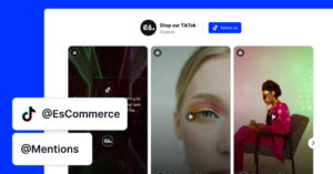
3. Community Social CTA section
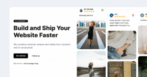
Our Community Social CTA section highlights active community engagement by showing real social content and a clear participation count, helping visitors instantly understand that people are already talking about and engaging with the brand.
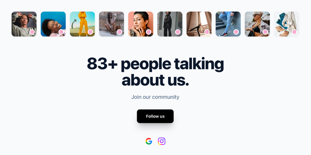
Section elements:
- Horizontal row of social media content thumbnails
- Section title: “83+ people talking about us.”
- Supporting text: “Join our community”
- Primary CTA button: “Follow us”
- Social platform icons (for example: Google and Instagram)
Works best for:
- SaaS and product marketing websites
- Ecommerce and DTC brands
- Landing pages that need quick trust reinforcement
- Community-driven platforms and template showcases
Get this template and turn your social content into an engaging website section.
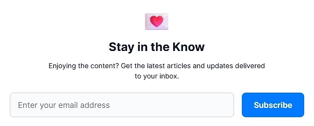
4. Newsletter CTA section
CTA section type: Content break section
AI prompt used: “Create a newsletter signup CTA section for a blog. Use a benefit-driven headline, minimal form fields, and a calm, non-intrusive layout.”
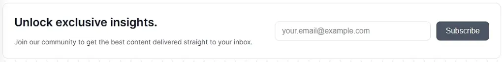
Why this CTA section works: It feels helpful rather than promotional. The CTA fits naturally into content flow and positions the newsletter as added value, not noise.
5. E-commerce purchase CTA section
CTA section type: Product-focused CTA section
AI prompt used: “Design an e-commerce CTA section encouraging product purchase. Highlight product benefits, include social reassurance, and add a strong primary purchase CTA.”

Why this CTA section works: The layout balances persuasion with confidence. Visual hierarchy guides attention to the purchase action while reinforcing trust.
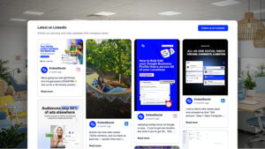
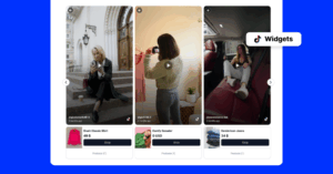
6. Social media CTA section
The Social media CTA section is a complete section that showcases a brand’s Instagram presence through a visual content grid, account preview, and follow action, helping visitors quickly understand the brand’s style and encouraging them to join the social community directly from the website.

Section elements:
- Section title (for example: “Follow us on Instagram”)
- Short description explaining the value of following the brand
- Instagram content grid with real posts
- Account avatar and username
- Post count indicator
- Primary follow button
Works best for:
- Ecommerce and lifestyle brands
- Visually driven products and creators
- Homepages, landing pages, and pre-footer sections
Get this template to showcase your community and social proof on your website.
7. Content download CTA section
CTA section type: Resource CTA section
AI prompt used: “A CTA section for downloading gated content. Highlights the practical value of the resource and keeps the action simple and focused.”

Why this CTA section works: The CTA clearly communicates what users get in exchange for their information, making the value exchange feel fair and worthwhile.
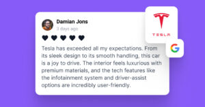
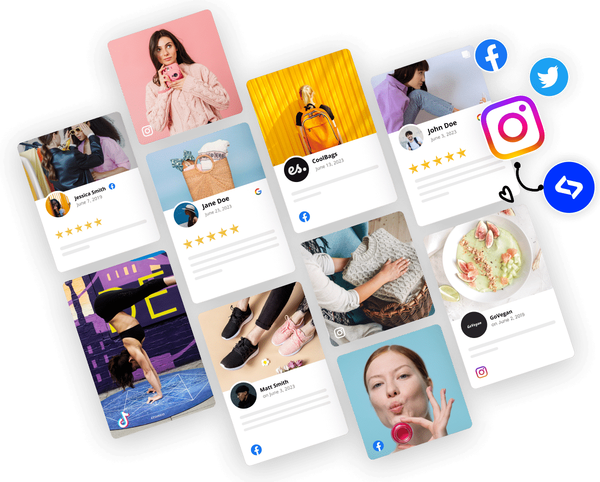
8. Social proof CTA section
The Social proof CTA section is a complete section that highlights real customer feedback by combining reviews, ratings, photos, and videos into a dynamic wall that helps visitors quickly understand how others experience the brand.
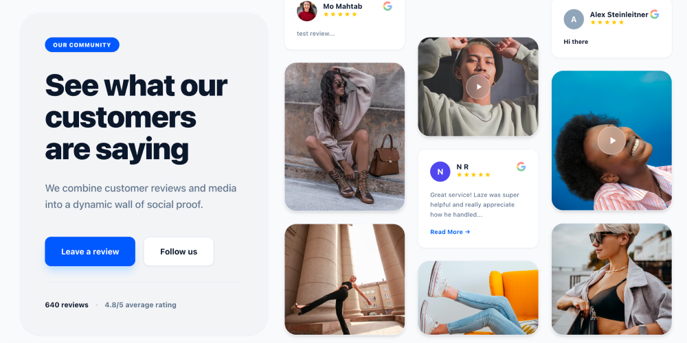
Section elements:
- Section label: “Our community”
- Section title: “See what our customers are saying”
- Section description: “We combine customer reviews and media into a dynamic wall of social proof.”
- Review cards with customer names, profile images, star ratings, and review text
- Video testimonials with play indicators
- Image-based customer content
- Primary CTA button: “Leave a review”
- Secondary CTA button: “Follow us”
- Social proof metrics (for example: “640 reviews” and “4.8/5 average rating”)
Works best for:
- Ecommerce and DTC websites where reviews influence purchase decisions
- SaaS products that need trust before sign-up
- Homepages and landing pages focused on credibility and validation
Get this template and showcase real customer voices as powerful social proof on your website.
9. Blog footer CTA section
CTA section type: Blog footer section
AI prompt used: “Design a blog footer CTA section that captures leads after content consumption. Use friendly copy and a low-commitment action.”
Why this CTA section works: It capitalizes on peak engagement after reading. The tone is relaxed, making the CTA feel like a logical next step.
10. Limited-time offer CTA section
CTA section type: High-contrast promotional section
AI prompt used: “Create a limited-time offer CTA section with urgency cues. Highlight scarcity without sounding aggressive, and include a bold primary CTA.”

Why this CTA section works: Urgency is communicated clearly but responsibly. Visual contrast and time-bound CTA language push action without overwhelming the user.
6 key elements of effective CTA sections
As you’ve seen from the call-to-action examples above, every high-converting CTA section follows a familiar pattern, and it’s not just the button. So, if CTAs fail, it’s usually because one of their main elements is missing, weak, or disconnected from the rest.
The good news is that you don’t need to invent these elements from scratch. With an AI UGC website builder, they can be generated and combined automatically.
Here are the core building blocks behind effective call-to-actions:
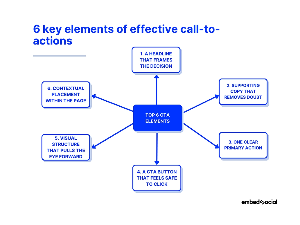
1. A headline that frames the decision
The purpose: A CTA section headline should make the next step feel logical, not forced. Weak CTA headlines talk about the product. Effective ones talk about the outcome.
Instead of “Our platform helps you grow”, strong CTA headlines anchor the decision in value: saving time, reducing risk, unlocking access, or gaining momentum. This is the mental shift that moves users from browsing to acting.
✨ Prompt to use to generate it:
“Generate a CTA section headline focused on the outcome users want, not the product features.”
2. Supporting copy that removes doubt
The purpose: This text answers the silent questions users have right before they click.
Good CTA sections clarify your products and services, so a single sentence is often enough to explain what happens next, who it’s for, or what’s included. When this copy is missing, users hesitate—even if they like what they see.
This is where effective calls-to-action quietly do their hardest work: lowering friction.
✨ Prompt to use to generate it:
“Add one line of supporting copy that clarifies what happens after the click and reduces hesitation.”
3. One clear primary action
The purpose: Focus beats choice.
A CTA section should revolve around one primary action—start a trial, request a demo, download a resource. Secondary links can exist, but they should never compete visually.
When everything is a CTA, nothing is. So, if you want a high-performing CTA section, you need to guide attention instead of scattering it.
✨ Prompt to use to generate it:
“Design a CTA section with one primary action and no competing links or secondary CTAs.”
4. A CTA button that feels safe to click
The purpose: The button is not decoration—it’s a promise.
Effective CTA buttons use copy that feels specific and low-risk. “Get started” works when context is strong. “Start my free trial” works when clarity matters more.
Design-wise, contrast and spacing matter more than color trends. The button should feel like the natural conclusion of the section, not an interruption.
✨ Prompt to use to generate it:
“Create a CTA button with specific, low-risk copy that clearly states the benefit of clicking.”
5. Visual structure that pulls the eye forward
The purpose: Design should guide, not distract.
Spacing, alignment, background contrast, and hierarchy all work together to funnel attention toward the action. Users should instinctively know where to look next without thinking.
This is where AI-generated CTA sections shine—because layout decisions are handled systematically, not emotionally, so you always get the best result.
✨ Prompt to use to generate it:
“Design the CTA layout with strong hierarchy, spacing, and contrast to guide the eye toward the action.”
6. Contextual placement within the page
The purpose: Timing is everything.
Effective call-to-actions appear when intent peaks—not randomly. Some CTA sections work best above the fold. Others convert better after value is explained or objections are addressed.
Remember: Great CTA sections don’t interrupt the journey. They meet users exactly where and when they’re ready to move forward.
✨ Prompt to use to generate it:
“Generate a CTA section optimized for high-intent users who are ready to take the next step.”
Keep in mind all these elements since when they work together, CTA sections stop feeling like marketing. They feel like the obvious next step.
And when they’re generated with AI—using prompts instead of manual design—you can test, iterate, and deploy them faster than ever, without breaking structure or consistency.
7 call-to-action design tips that actually work
Most CTA advice sounds good in theory.
Thankfully, I got actionable tips for you that will help you create the best CTA for your niche. These are practical, battle-tested call-to-action tips—not trends:
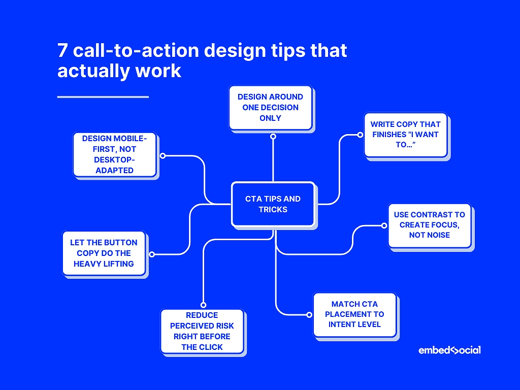
- Design around one decision only—each CTA section should answer a single question and push one action.
- 🚀 Example: A pricing page CTA section with the headline “Ready to get started?” and a single button saying “Start free trial”. No secondary links, no competing actions, no distractions.
- Write copy that finishes the sentence “I want to…”—effective call to actions speak in outcomes, not features.
- 🚀 Example:
- Headline: “Turn website visitors into leads”
- CTA button: “I want more leads”
- 🚀 Example:
- Use contrast to create focus, not noise—strong CTA sections stand out through spacing and hierarchy before color.
- 🚀 Example: A mid-page CTA section with a neutral background, plenty of white space, and one bold button in a contrasting color. No gradients, no multiple colors—just visual hierarchy that pulls the eye to the action.
- Match CTA placement to intent level—early CTAs sell the promise, later CTAs close the deal. So, you need soft CTA buttons early on, with the main CTA appearing at the end.
- 🚀 Example:
- Hero CTA: “See how it works” (low commitment, early intent)
- Bottom-of-page CTA: “Start your free trial” (high intent, decision-ready)
- 🚀 Example:
- Reduce perceived risk right before the click—small reassurances near the CTA outperform long explanations above it.
- 🚀 Example:
- CTA button: “Start free trial”
- Small text below: “No credit card required · Cancel anytime”
- 🚀 Example:
- Let the button copy do the heavy lifting—specific CTA button text consistently beats generic labels.
- 🚀 Example:
- Instead of “Submit” → “Get my free report”
- Instead of “Sign up” → “Create my account in 60 seconds”
- 🚀 Example:
- Design mobile-first, not desktop-adapted—most website CTA button examples succeed or fail on small screens.
- 🚀 Example: A CTA section where the headline fits on two lines, the button spans the full width on mobile, and there’s enough spacing to tap comfortably—because most website CTA examples win or lose on small screens.
Just apply all of these call-to-action tips together to stop your CTA sections from feeling forced. Instead, they will look and sound timely, clear, and hard to ignore.
How to generate a CTA section via EmbedSocial’s AI widget builder?
You don’t need to rebuild an entire landing page to improve conversions. You just need to upgrade individual sections—especially CTA sections that guide users to act.
That’s where EmbedSocial’s AI UGC website builder comes in. Instead of locking you into a full-page editor, it lets you generate and embed high-converting CTA sections—along with heroes, testimonials, and visual blocks—directly into any existing page.
Here’s how to create AI-generated CTA sections step by step.
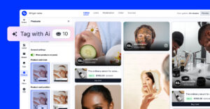
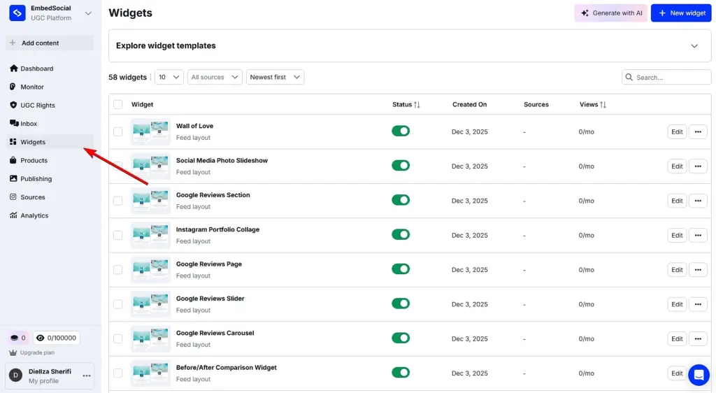
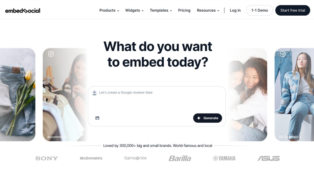
Step 1: Open the Widgets area in EmbedSocial
Log in to your EmbedSocial account or start a free trial. From the left-hand menu, go to Widgets, where all AI-generated sections—including CTA sections—are created and managed.
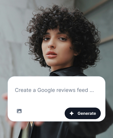
Step 2: Describe the CTA section you want to generate
Click Generate with AI in the top-right corner to open the editor.
Here, you simply describe the CTA section you want—hero CTA, mid-page CTA, footer CTA, or any other variant—using plain language.
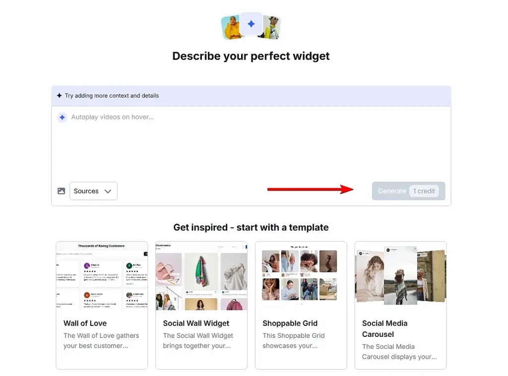
You can also upload an image to give the AI visual context. Once your prompt is ready, click Generate to create a complete CTA section with layout, copy, and structure already in place.
Pro tip: If you prefer a faster start, you can choose a built-in template and customize it instead of writing a prompt from scratch.
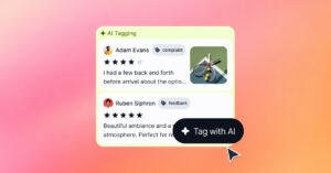
Optional: Connect UGC or reviews for social proof CTAs
If your CTA section relies on trust—such as social proof or testimonials—you can connect your review or UGC sources from the Sources tab.
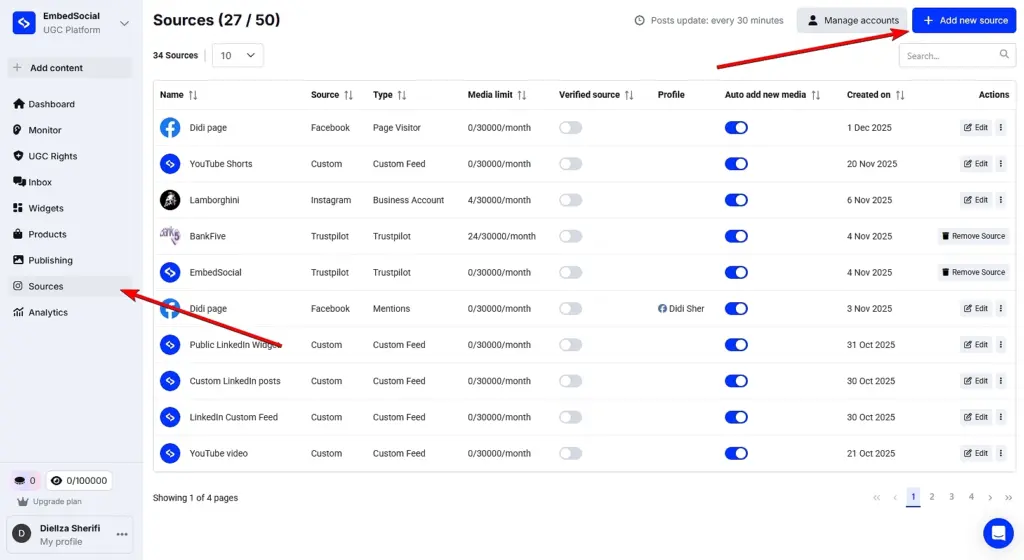
This allows you to pull in real customer reviews or social media feeds and display them dynamically inside your CTA section, keeping it fresh and credible instead of static.
Step 3: Refine the CTA section until it fits your page
You can continue refining the CTA section by prompting the editor again. Adjust headlines, CTA copy, layout, visuals, spacing, or even swap the connected UGC source.
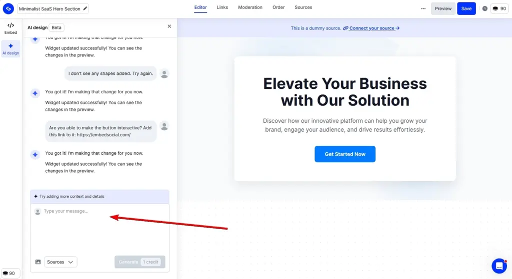
This makes it easy to test different CTA sections and variations without touching code or rebuilding the rest of the page—ideal when optimizing website CTA examples for performance.
Step 4: Embed the CTA section on your website
Once you’re satisfied with the result, open the Embed tab and copy the embed code. Paste it into the desired spot on your site and publish.
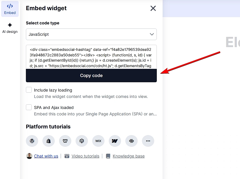
Note: EmbedSocial’s widget codes work with all popular website builders, such as Shopify, WordPress, Wix, Webflow, Weebly, Lovable, Wix, Bolt, V0and even Notion.
Common mistakes to avoid when generating CTA sections
As you build and embed CTA sections, watch out for:
- vague headlines that don’t communicate value,
- visually overloaded layouts that distract from the action,
- multiple CTAs competing for attention,
- poor mobile responsiveness,
- inconsistent branding or typography.
Used thoughtfully, EmbedSocial gives you the flexibility to upgrade, test, and optimize CTA sections independently—so your landing pages improve without starting from scratch.
How EmbedSocial’s AI change CTA section designs?
You don’t have to rebuild entire pages inside rigid editors any longer.
With the latest AI design tools like EmbedSocial’s, modern teams focus on improving the sections that actually drive conversions—CTA sections, hero blocks, social proof, etc.
So, rather than acting as a traditional page builder, EmbedSocial works as an AI-powered website design tool for sections. It helps teams generate, customize, and embed high-converting CTA sections using AI without replacing their existing site or workflow.
Here’s how EmbedSocial’s AI changes CTA section design in practice:
- Build landing pages section by section—generate CTA sections, hero blocks, testimonial sections, UGC galleries, and benefit grids without rebuilding the full page;
- Use AI to generate conversion-ready CTA sections—the AI widget generator creates layouts, headlines, and CTAs aligned with proven landing page best practices;
- Act as a flexible landing page creator, not a locked editor—embed AI-generated CTA sections into any website, CMS, or landing page builder you already use;
- Design like a landing page designer, without design skills—adjust spacing, typography, visuals, and branding while keeping AI-guided structure intact;
- Choose from multiple layout templates—start with ready-made section layouts and let AI adapt them to your CTA if you lack inspiration at the moment;
- Turn social proof into a live conversion asset—pull online reviews, testimonials, and UGC directly into CTA sections so they stay fresh and credible;
- Work with any existing landing page builder—use EmbedSocial alongside Webflow, WordPress, Shopify, Wix, or custom sites via simple embed code;
- Optimize and iterate faster—swap individual CTA sections to test copy, layout, or messaging without touching the rest of the page.
Note: EmbedSocial is built to make the most important conversion sections—especially CTA sections—perform better, faster, and more consistently using simply AI prompts.
Conclusion: Build better CTA sections faster with AI-powered tools!
To make it simple: to get high-performing CTA sections, you need to focus on clarity, structure, and speed, i.e., get the right CTA message in front of users exactly when they want to act.
Thankfully, there are AI-powered tools like EmbedSocial nowadays that can help you redesign entire pages in minutes. With them, you can now generate, test, and refine CTA sections independently, using proven layouts and conversion-focused copy as a starting point.
Meaning, if you want to build multiple CTA buttons faster—and turn more visitors into action-takers—AI-driven compelling CTAs give you the advantage that makes it practical.
So, check out EmbedSocial and its modular design approach to website elements like CTA sections—it’s more flexible and easier to iterate on. You just rework the same CTA.
Plus, it’s a complete UGC platform, which means you have access to all that convincing social proof created by the public and your customers. You can infuse anything you create via our AI widget builder with everything from online reviews to social media posts.
FAQs about CTA sections
What is a CTA section?
A CTA section is a dedicated area on a webpage designed to prompt users to take a specific action, such as signing up, buying, or downloading. However, unlike a single call-to-action button, a CTA section combines copy, layout, and design to drive conversions.
What is a CTA component?
A CTA component is a single element within a CTA section, such as a button, headline, or text. While a CTA component plays a role, it’s the full CTA section that drives conversions.
What is an example of a CTA section?
An example of a CTA section is a hero block with a clear headline, short supporting text, and a primary CTA button like “Start your free trial”. Note that the best CTA section examples combine copy, layout, and design to guide users toward one action.
What are good CTAs?
The best CTA examples focus on clarity and value rather than pressure. High-performing website CTA examples often include a clear headline, one CTA, and supporting text.
What makes an effective call to action?
Effective calls-to-action are clear, focused, and tied to a single goal. They use outcome-driven copy, strong visual hierarchy, and are placed where user intent is highest.
Can AI tools help design CTA sections?
Yes, AI tools for web design can generate complete CTA sections by combining layout, copy, and structure. Furthermore, advanced AI website design tools like EmbedSocial help teams create, test, and optimize CTA sections faster without rebuilding entire pages.